Growth · alternatives · 2026

24 alternatives to Graphico Pro
Clean dataset visualization made simple.
Below are 24 products that do a similar job, ranked by how close each is in meaning and then by launch-day votes. Prices are shown for the 1 we have checked on their own sites, 1 of them free or with a free tier.
- 1

Create pro-level graphs that drive actions
2024 · graphy.app · its alternatives →
- 2
 Pandada AI▲620
Build data wealth: Turns files into McKinsey-level insights
Jan 2026 · pandada.ai · its alternatives →
- 3

- 4
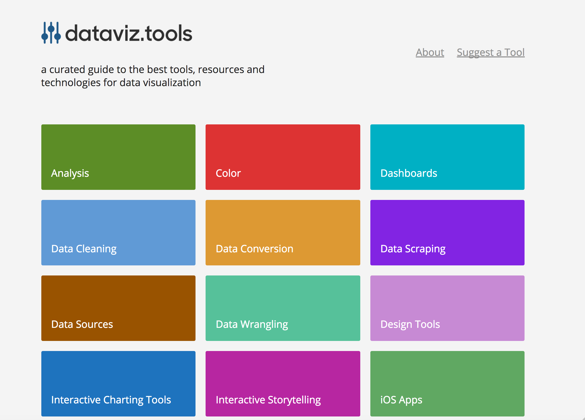 dataviz.tools▲409
Curated collection of the 400 best data visualization tools
2017 · dataviz.tools · its alternatives →
- 5

- 6

Creating data visualizations with AI nowadays often means chat, chat and more chats...and writing long prompts can be annoying while they are also not the most effective way to describe your visualization designs. Data Formulator blends UI interaction with natural language so that you can create visualizations with AI much more effectively! You can: * create rich visualizations beyond initial datasets, where AI helps transforming and visualizing data along the way * iterate your designs and dive deeper using data threads, a new way to manage your conversation with AI. Here is a demo video:…
2024 · github.com · its alternatives →
- 7BA
2019 · bamboolib.com · its alternatives →
- 8

- 9

Make powerful, interactive machine learning visualizations
2020 · wandb.ai · its alternatives →
- 10

- 11

Probly was built to reduce context-switching between spreadsheet applications, Python notebooks, and AI tools. It’s a simple spreadsheet that lets you talk to your data. Need pandas analysis? Just ask in plain English, and the code runs right in your browser. Want a chart? Just ask. While there are tools available in this space like TheBricks, Probly is a minimalist, open-source solution built with React, TypeScript, Next.js, Handsontable, Hyperformula, Apache Echarts, OpenAI, and Pyodide. It's still a work in progress, but it's already useful for my daily tasks.
2025 · github.com · its alternatives →
- 12IB
grafar is a JavaScript library for creating visualizations on the web, with 3D support via WebGL. Built for mathematical plotting, but also can also handle data visualization.
2021 · thoughtspile.github.io · its alternatives →
- 13
 Chartbrew v2▲197
Visualize data from all your data sources in one place
2022 · chartbrew.com · its alternatives →
- 14VO
Hello HN. I've always found writing data visualisation scripts boring and repetitive in data science workflows earlier in my career, so I built this tool to automate it. The available methods are based on my experience in econometrics where histograms and scatterplots were the starting points to check data distributions. The link is to the documentation and the app is freely available at https://visprex.com, and if you're curious about the implementation it's open source at https://github.com/visprex/visprex. I'd appreciate any comments and feedback!
2024 · docs.visprex.com · its alternatives →
- 15LV
2016 · alooma.com · its alternatives →
- 16

No-code real-time data visualizations for anything
2021 · its alternatives →
- 17

Explore, visually communicate and make sense of the data
2021 · graphica.app · its alternatives →
- 18

App to easily query, script, and visualize data from every database, file, and API. - multiprocessio/datastation
2022 · github.com · its alternatives →
- 19

- 20

Ultra-fast and customizable Python charts. Contribute to reflex-dev/xy development by creating an account on GitHub.
Jul 2026 · github.com · its alternatives →
- 21

Turn Tables Into Stunning Graphs-No Coding, Just Clarity!
2025 · its alternatives →
- 22

- 23
 BStreams▲62
Interactive, easy, responsive data visualization & analysis
2021 · bstreams.io · its alternatives →
- 24
 ChartPixel▲80
Extract & visualize key insights from raw data in seconds!
2024 · chartpixel.com · its alternatives →
Also compare
Ranked by how close each launch is in meaning, then by votes. Prices were read from each product’s own site when checked and can change. Refine with your own description →