Dev tools · alternatives · 2026

24 alternatives to Visualize Git commit histories as animated force-directed graphs
Visualize and analyze complete Git commit histories as animated force-directed graphs. See how commit density, branch activity, and contributor participation evolve over time. Live site: https://nshcr.github.io/git-commits-threadline/ This project helps you quickly inspect: - repository growth over long time ranges - branch structure and active thread distribution - contribution patterns across maintainers and collaborators
Below are 24 products that do a similar job, ranked by how close each is in meaning and then by launch-day votes.
- 1

Visualize a GitHub repository
Jun 2026 · gitstock.org · its alternatives →
- 2
 Git History▲10
Visualize any GitHub repository with beautiful interactive graphs and star history charts. Features: Interactive Force Graph - Explore repository structure with draggable, zoomable nodes Pack View - Circle-packing visualization showing files nested inside folders Star History - Beautiful charts showing repository growth over time Embeddable Charts - Add live star history SVG to your README (dark & light themes) Commit Timeline - Watch commits animate through the codebase Multi-Repo Comparison - Compare star histories of multiple repositories Chrome Extension - View star history directly on…
Jan 2026 · git-history.com · its alternatives →
- 3

An Interactive History of the Git Distributed Version Control System
2021 · git-history.jpalmer.dev · its alternatives →
- 4

Display an activity graph (like the contribution graph on GitHub) for the current git repository and branch - aaossa/git-activity
2022 · github.com · its alternatives →
- 5

Visualise a git repository by diff activity. Contribute to jmforsythe/Git-Heat-Map development by creating an account on GitHub.
2023 · github.com · its alternatives →
- 6

- 7

I built a tool which you can use to visualise your git commits at an org or repository level. It shows just how much work an engineering team, or even an individual does, that often goes unseen by non-dev teams. You can read about the build here: https://ably.com/blog/visualize-your-commits-in-realtime-wit... Repo is here: https://github.com/ably-labs/github-commit-visualizer You can deploy your own to netlify (or provider of your choice) and start visualising your own project's commits in realtime.
2022 · github-vis.ably.dev · its alternatives →
- 8
 Git Skyline▲142
A 3D visualization of your Git contributions
2024 · git-skyline.huakun.tech · its alternatives →
- 9

2012 · github.com · its alternatives →
- 10

Generate timesheets from GitHub code history. Free
2018 · its alternatives →
- 11

Hi HN! I'm Gabriel, the author of dep-tree (https://github.com/gabotechs/dep-tree), and I wanted to show off this tool and explain why it's being really useful at my current org for dealing with code complexity. I work at a startup where business evolves really fast, and requirements change frequently, so it's easy to end up with big piles of code stacked together without a clear structure, specially with tight deadlines. I made dep-tree [1] to help us maintain a clean code architecture and a logical separation of concerns between parts of the application, which is…
2024 · github.com · its alternatives →
- 12

Data-driven engineering. Contribute to codealong/codealong development by creating an account on GitHub.
2019 · github.com · its alternatives →
- 13
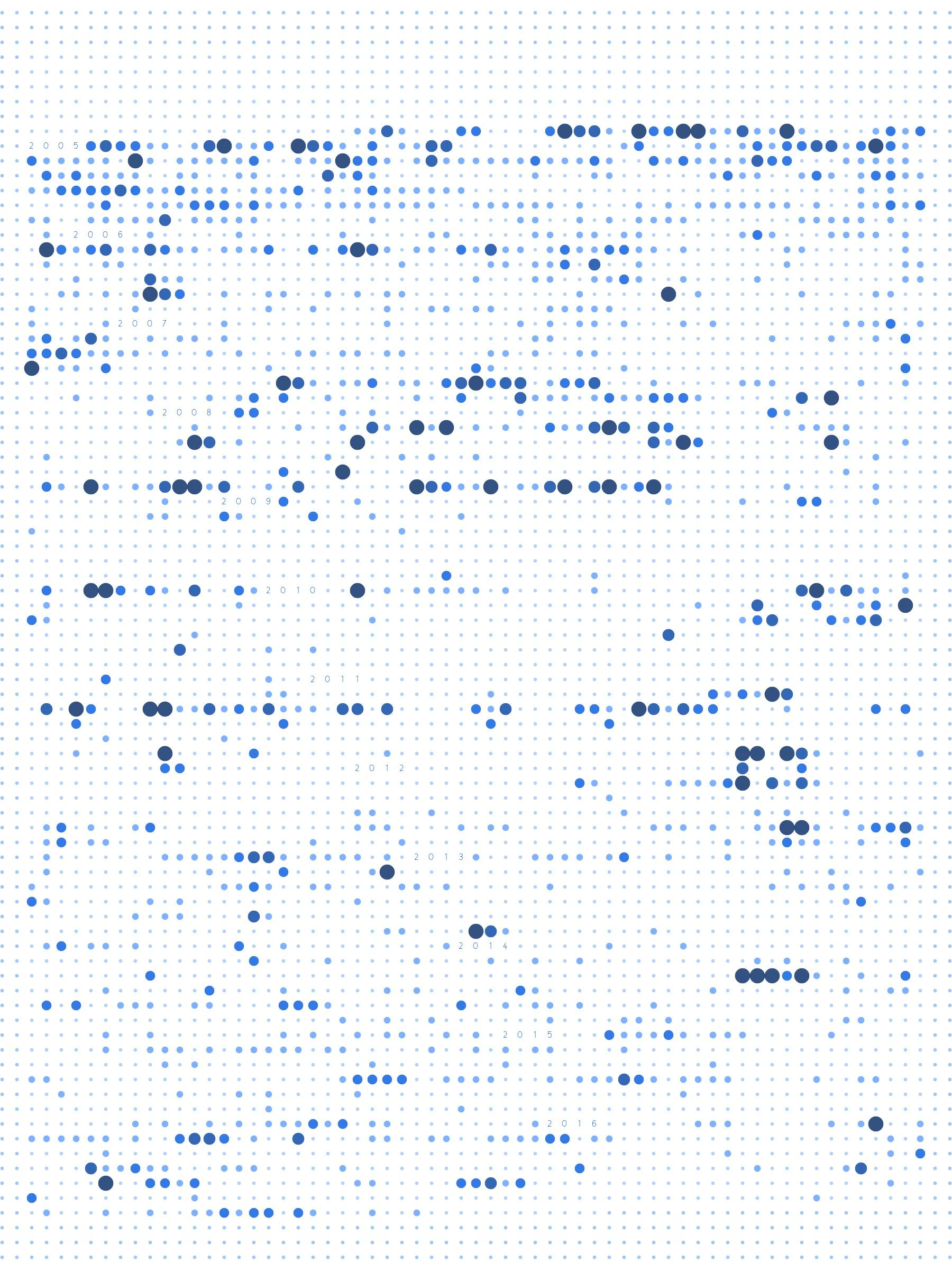
- 14

▁▅▆▃▅ Git quick statistics is a simple and efficient way to access various statistics in git repository. - git-quick-stats/git-quick-stats
2019 · github.com · its alternatives →
- 15

Preceden is a free online timeline maker. Generate a timeline with AI or build one from scratch for project plans, school assignments, fiction, and more.
2022 · preceden.com · its alternatives →
- 16GP
2016 · veniversum.github.io · its alternatives →
- 17

Hey folks, I just released a new CLI tool called gmap, built in Rust, focused on exploring Git history visually and efficiently from your terminal. Highlights: • Heatmap view: weekly commit activity with churn and delta stats • Filetype breakdown: see which file extensions are most active • Authorship insight: per-week top contributors • Timeline and trends: sparkline and stats over time • TUI mode (–tui): navigate interactively, search, filter, view stats • Export mode: get all Git stats as JSON for further processing Install with: cargo install gmap Or check it out here:…
2025 · github.com · its alternatives →
- 18TY
2011 · hulkort.herokuapp.com · its alternatives →
- 19

Decentralized Issue Tracking for git. Contribute to git-dit/git-dit development by creating an account on GitHub.
2017 · github.com · its alternatives →
- 20

- 21

commit/branch/workdir explorer for git. Contribute to isacikgoz/gitin development by creating an account on GitHub.
2019 · github.com · its alternatives →
- 22

Tool for visualizing GitHub profiles. Contribute to tipsy/profile-summary-for-github development by creating an account on GitHub.
2017 · github.com · its alternatives →
- 23

View and print a 3D model of your GitHub contribution graph
2021 · skyline.github.com · its alternatives →
- 24

Here you can find some insights into GitHub real-time contribution, including pull request events grouped by programming languages, top 5 active repositories and developers last 24 hours.
2022 · live.ossinsight.io · its alternatives →
Also compare
- Gitstock–Transform you GitHub commit history into K-line and animations alternatives
- Git History alternatives
- An interactive visual history of Git development alternatives
- Contribution Graph as a Git Command alternatives
- Git Heat Map – a tool for visualising git repo activity for each file alternatives
- Git Story alternatives
Ranked by how close each launch is in meaning, then by votes. Prices were read from each product’s own site when checked and can change. Refine with your own description →