AI · alternatives · 2026
24 alternatives to Visualize GitHub: Visualizations of Your GitHub Repos
Discover the impossible The only engine with graph-wide scanning and integrated AI for: Preview text Schedule a Demo Learn More […]
Below are 24 products that do a similar job, ranked by how close each is in meaning and then by launch-day votes. Visualize GitHub: Visualizations of Your GitHub Repos launched in 2016; newer entries below may have overtaken it.
- 1
- 2
- 3

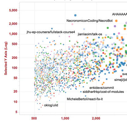
Visualize GitHub's most popular repos. http://www.donnemartin.com/viz - donnemartin/viz
2016 · github.com · its alternatives →
- 4

View and print a 3D model of your GitHub contribution graph
2021 · skyline.github.com · its alternatives →
- 5

- 6

Increase LLM visibility, signups and activated users
Nov 2025 · nakora.ai · its alternatives →
- 7GP
2016 · veniversum.github.io · its alternatives →
- 8

I explored an alternative way to view codebases to the typical folder/file list, showing a bird's-eye-view of its structure. https://octo.github.com/projects/repo-visualization
2021 · octo.github.com · its alternatives →
- 9

Tool for visualizing GitHub profiles
2018 · profile-summary-for-github.com · its alternatives →
- 10
 GitHub Tree▲151
Visualize repo structures in tree view.
2025 · githubtree.mgks.dev · its alternatives →
- 11

- 12
 Git Skyline▲142
A 3D visualization of your Git contributions
2024 · git-skyline.huakun.tech · its alternatives →
- 13

- 14

Visualise a git repository by diff activity. Contribute to jmforsythe/Git-Heat-Map development by creating an account on GitHub.
2023 · github.com · its alternatives →
- 15

A cool way to visualize Commits, Contributions and Issues
2016 · rocketgraph.com · its alternatives →
- 16

Visualize all of Github's awesome lists
2021 · awesome.digitalbunker.dev · its alternatives →
- 17GT
- 18VV
2017 · donnemartin.com · its alternatives →
- 19
- 20GR
I built this as part of my quest to properly learn data visualization. The code is the easy part! Some lessons learned: - personal verification of the the general truth that pie charts are tough! and the returns are not great for the effort due to people's difficulties perceiving angles - may not use "vanilla" d3 with no React. was difficult to adapt for mobile - the GitHub API provides fairly standardized responses so building dynamic charts wasn't too bad. But when working with streaming data (say Kafka) I can see this getting interesting... schema registry should help but creating a view…
2024 · see-my-repo.netlify.app · its alternatives →
- 21

I built a tool which you can use to visualise your git commits at an org or repository level. It shows just how much work an engineering team, or even an individual does, that often goes unseen by non-dev teams. You can read about the build here: https://ably.com/blog/visualize-your-commits-in-realtime-wit... Repo is here: https://github.com/ably-labs/github-commit-visualizer You can deploy your own to netlify (or provider of your choice) and start visualising your own project's commits in realtime.
2022 · github-vis.ably.dev · its alternatives →
- 22TechStacks▲12
Tree visualization of popular web dev Github repos
2024 · tech-stacks.vercel.app · its alternatives →
- 23

2012 · aaronparecki.com · its alternatives →
- 24


Also compare
Ranked by how close each launch is in meaning, then by votes. Prices were read from each product’s own site when checked and can change. Refine with your own description →