
Adaptive images
Deliver smaller images to smaller devices.
Adaptive images launched on January 18, 2015 with 117 votes, #214 of 1,772 launches that month and more than 90% of that year's launches. The site was still online in September 2026, 11 years on.
What it does
Automatically adapt your existing website images for mobile devices. No mark-up changes needed. For use with CSS3 Responsive Designs.
Adaptive Images detects your visitor's screen size and automatically creates, caches, and delivers device appropriate re-scaled versions of your web page's embeded HTML images. No mark-up changes needed. It is intended for use with Responsive Designs and to be combined with Fluid Image techniques. Why? Because your site is being increasingly viewed on smaller, slower, low bandwidth devices. On those devices your desktop-centric images load slowly, cause UI lag, and cost you and your visitors un-necessary bandwidth and money. Adaptive Images fixes that. This approach was inspired by Filament Group's experiment , which had some problems . You may like to see a video explaining why adapting…from adaptive-images.com
Does a similar job
all alternatives →
 Responsive Image Breakpoint Generator2016 · responsivebreakpoints.com · ▲186
Turn one image into the ideal set of per-device images



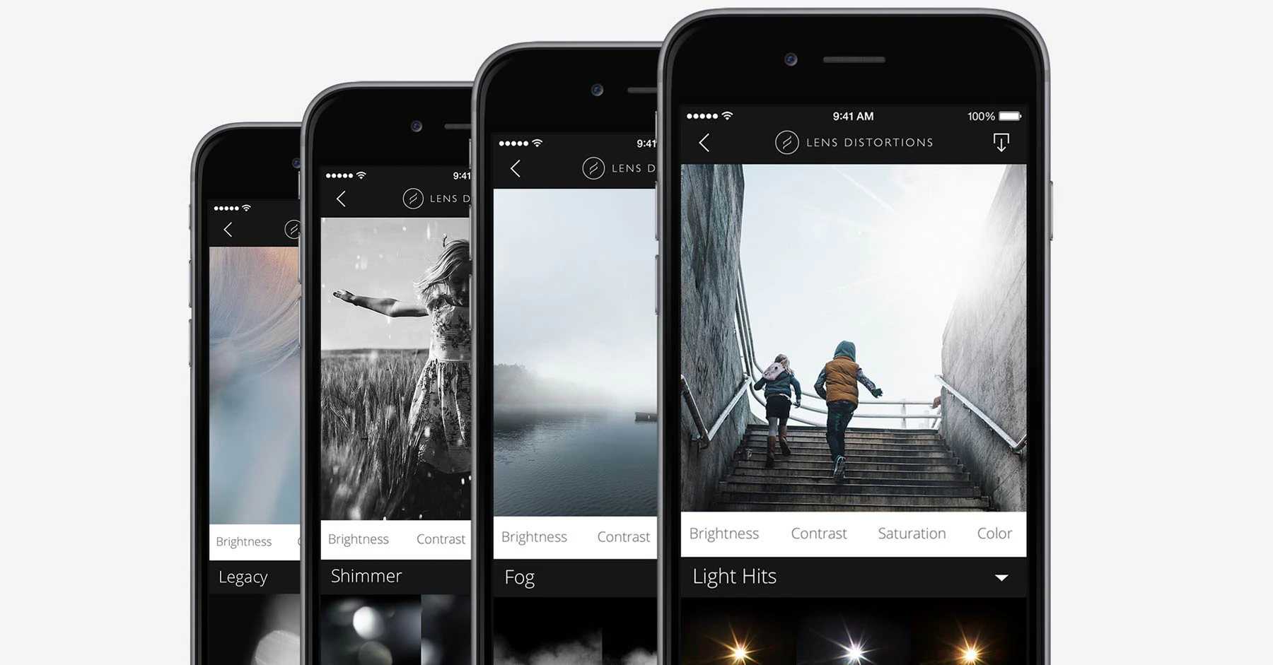 Lens Distortions2015 · lensdistortions.com · ▲85
Beautiful effects crafted from optically captured elements.
More work this month
the category →
Endless lofi beats composed live in your browser, over pixel-art nights in Paris, Tokyo, New York, Hong Kong, Sydney, San Francisco and more. Free, no sign-up.
Work · 24d ago · loficities.com
 Smooth Recorder▲257
Mac screen recordings that look edited when you hit stop
Work · 18d ago · smoothrecorder.com


Work · 12d ago · readrare.com
Source: Product Hunt launch ↗
Launched alongside, January 2015
the whole month →


A place to discover ideas that VCs & angels want to fund
Commerce · 2015 · docs.google.com

Send glitter to the people that deserve it
Life & fun · 2015 · shipyourenemiesglitter.com

