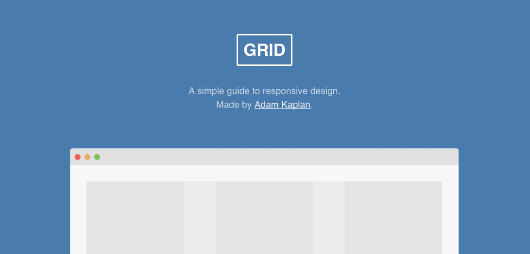
Grid
A simple guide to responsive design.
Grid launched on April 15, 2016 with 5 votes. The site was still online in September 2026, 10 years on.
What it does
We want our websites to be useable on all devices by responding to the user’s behavior, screen size and screen orientation. As of 2013 , there are thousands of different devices and screen sizes that browse the internet, so it’s impossible to design layouts to target them all. Instead, we must take a more fluid approach to design. The term “mobile first” gets thrown around a lot lately. What it really means is to start with mobile styles and layer on styles optimized for larger screens only as needed. In other words, your mobile styles become the default and you no longer have to override them later. It’s much simpler! By assuming a flexible but simple layout by default, you can better…from adamkaplan.me
Does a similar job
all alternatives →



More work this month
the category →
 Smooth Recorder▲257
Mac screen recordings that look edited when you hit stop
Work · 25d ago · smoothrecorder.com


Work · 19d ago · readrare.com
Source: Product Hunt launch ↗
Launched alongside, April 2016
the whole month →


Access all the files on Dropbox without having to sync
Work · 2016 · blog.dropbox.com

The easiest way to build an FB bot. No coding required!
Dev tools · 2016

Quickly find your Bootstrap classes on this interactive Bootstrap cheat sheet. It includes code samples and live preview of elements.
Dev tools · 2016 · hackerthemes.com