Growth · alternatives · 2026

24 alternatives to Bubble Or Not?
Is a stock overvalued? Chart its price vs fundamentals
Below are 24 products that do a similar job, ranked by how close each is in meaning and then by launch-day votes.
- 1

Here's a little side project I’ve been working on: https://totalrealreturns.com/ The Total Real Returns chart demonstrates the preservation or growth of real wealth more clearly than conventional (nominal-dollar, price-only) stock charts, because: (1) we include the effects of inflation-diminished purchasing power, and (2) we include the effects of reinvesting dividends from the initial investment. I found it harder to explain the y-axis in words than it was to do the math, so please let me know if you think the "baguettes" explanation on the homepage helps. I was up until 4am…
2022 · totalrealreturns.com · its alternatives →
- 2

Live stock market crash risk indicator updated daily. Uses VIX, PE ratio, Buffett Indicator, and Treasury yields to calculate current crash probability.
2017 · isthestockmarketgoingtocrash.com · its alternatives →
- 3
 Bubble Screener▲123
Interactive bubble charts for stock markets
2024 · bubblescreener.com · its alternatives →
- 4
 TradingView▲300
The best charting tool for crypto and stocks
2014 · tradingview.com · its alternatives →
- 5

- 6

- 7

- 8

- 9

A few weeks ago I got an idea for a more interesting interface to check the stock market. The huge list of symbols in a table view that are either green or red (the same red and green whatever the gain is 0.1% or 10%) is not really cool for fast scanning, nor fun to use. Since I happen to be involved with an iPhone and iPad devleopment company here in Sicily since a few years, as share holder and "advisor", I suggested the idea to this friends of mine. As there was no really development bandwidth to do things like this, as they mostly work for other companies creating applications for the…
2011 · itunes.apple.com · its alternatives →
- 10
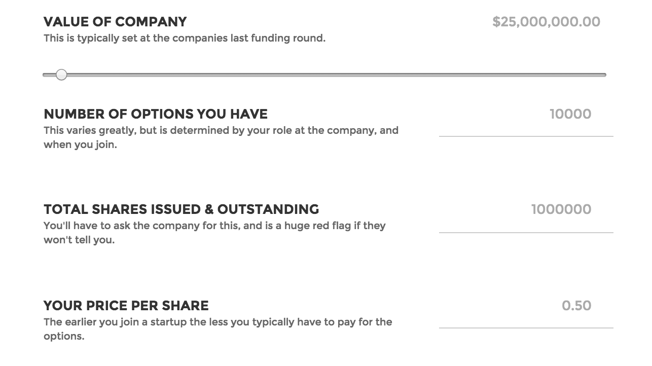 Options Worth▲200
Find out what your stock options are worth
2015 · optionsworth.com · its alternatives →
- 11

It’s easy to procrastinate when investing. Get over it!
2021 · joinforay.com · its alternatives →
- 12
 Guess the Stock▲126
Can you identify the stock from the chart?
2021 · guessthestock.com · its alternatives →
- 13

- 14

Invest in Apple earnings, not Apple stock, for free
2023 · trading.fluidinvesting.com · its alternatives →
- 15
 Air Charts▲73
Simple, beautiful, powerful financial charts for investing
2024 · apps.apple.com · its alternatives →
- 16

Assess the impact of financial news topics on asset prices
2024 · tradervoice.ai · its alternatives →
- 17

Are we in a tech bubble? Planet Money’s take.
2015 · its alternatives →
- 18
 TradingBro▲75
Analyze stocks instantly with credible data source
2023 · docs.google.com · its alternatives →
- 19

- 20

- 21

- 22

Seen a great stock? 6 month later it's gone nowhere! Why?
2016 · soundcloud.com · its alternatives →
- 23

An honest risk-read on hyped stocks. Check any ticker for dilution, over-extension, and a crowd showing up late, before you buy. Educational, not financial advice.
Jul 2026 · pumpproof.com · its alternatives →
- 24

Find undervalued stocks in minutes
2025 · play.google.com · its alternatives →
Also compare
Ranked by how close each launch is in meaning, then by votes. Prices were read from each product’s own site when checked and can change. Refine with your own description →