Alternatives
Products that do what Continuum, a pedantic recreation of the OMNI font does
"Pedantic" in this case means, "If it didn't show up in the magazine, it isn't part of the font." That means there are no lower-case letters and a few other symbols, but there are alternate letterforms as the font changed over the years. Default kerning is set to be as close to "type a word and get a perfectly set header" as possible, keeping in mind that was done by hand back in the day, and this is a digital recreation. Typing "OMNI" in "upper case" should emit a perfectly set masthead. Includes various symbols used throughout an issue, like the "Anti-matter" symbol and end-of-article…
- 1
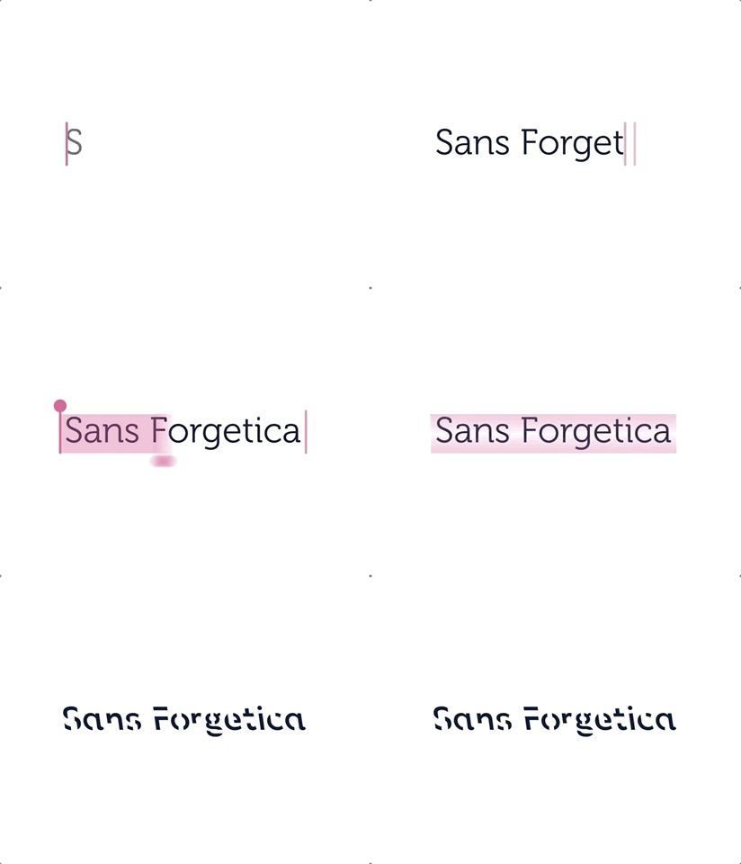
- 2VG
2021 · coderelay.io
- 3
- 4
- 5
- 6O8
2024 · webdraft.hu
- 7IM
2018 · github.com
- 8
- 9
- 10

- 11
- 12BM
2022 · berkeleygraphics.com
- 13
- 14
- 15

- 16
- 17
- 18
- 19MV
Originally we (Andrey, Marcus, Juho) built MonoLisa in 2020 as we realised there's room for a better monospaced typeface for developers. The key insight was to make the glyphs slightly wider to make more room for design to make letters like m feel less cramped. Since then we've released a variable v2 (2022) and now we're happy to expand the typeface with a new family called MonoLisa Text. The reasoning was to cover *other* use cases beyond coding with this proportional font. We hope you give Monolisa a go as there's a free trial to try. We also welcome feedback!
Jun 2026 · monolisa.dev
- 20
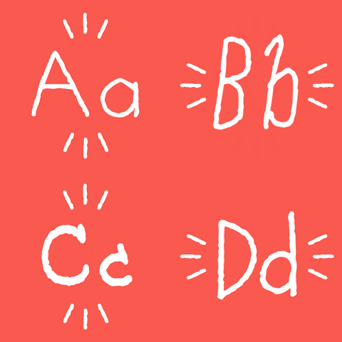
- 21
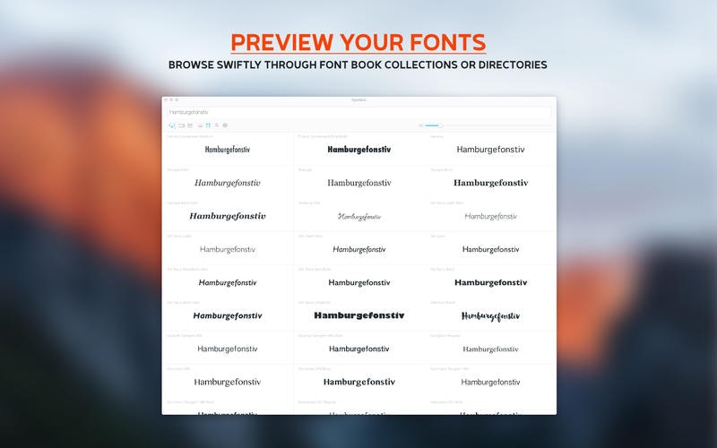
- 22
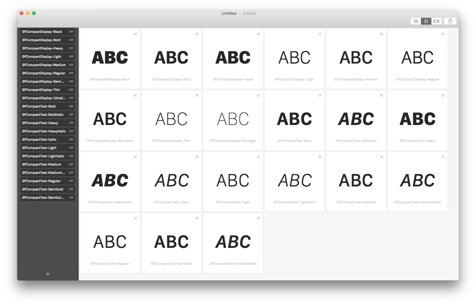
- 23
- 24

Ranked by how close each launch is in meaning, then by votes. Refine with a description →