Work · alternatives · 2026

24 alternatives to DataViz Kit
Powerful Free Data Visualization Tools
Below are 24 products that do a similar job, ranked by how close each is in meaning and then by launch-day votes.
- 1
 dataviz.tools▲409
Curated collection of the 400 best data visualization tools
2017 · dataviz.tools · its alternatives →
- 2

Find the right data visualization tool: 291 charting libraries, maps, graph and network visualization, dashboards and more for JavaScript, Python, R and beyond, with live GitHub stars and activity.
18d ago · awesomedataviz.com · its alternatives →
- 3
 Chartopedia▲161
The simplest way to choose the right chart type for dataviz
2017 · anychart.com · its alternatives →
- 4

Free chart maker & visual exploration for spreadsheet data
2020 · its alternatives →
- 5

- 6

- 7

Layout is a rust library and a tool that renders Graphviz dot files. - nadavrot/layout
2022 · github.com · its alternatives →
- 8

- 9

Turn any dataset into beautiful interactive charts
Mar 2026 · datavisual.app · its alternatives →
- 10
 Chartbrew v2▲197
Visualize data from all your data sources in one place
2022 · chartbrew.com · its alternatives →
- 11

Free online tool to create beautiful charts
2024 · textquery.app · its alternatives →
- 12

Chart templates kit for dashboards prototyping
2018 · setproduct.com · its alternatives →
- 13

- 14VO
Hello HN. I've always found writing data visualisation scripts boring and repetitive in data science workflows earlier in my career, so I built this tool to automate it. The available methods are based on my experience in econometrics where histograms and scatterplots were the starting points to check data distributions. The link is to the documentation and the app is freely available at https://visprex.com, and if you're curious about the implementation it's open source at https://github.com/visprex/visprex. I'd appreciate any comments and feedback!
2024 · docs.visprex.com · its alternatives →
- 15

Reference tool for data visualisation
2016 · datavizcatalogue.com · its alternatives →
- 16
 dataxreports.com▲118
Browse our ready-to-use Google Data Studio templates
2024 · dataxreports.com · its alternatives →
- 17
 Vizician▲77
Drag & drop your data for instant visual data exploration
2022 · vizician.com · its alternatives →
- 18
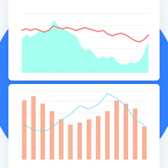
The biggest data visualization design kit for Sketch
2020 · crafted.graphics · its alternatives →
- 19

A tool to create animated graph visualizations, based on graphviz. - GitHub - mapio/GraphvizAnim: A tool to create animated graph visualizations, based on graphviz.
2016 · github.com · its alternatives →
- 20

- 21
- 22DA

Dear HN, I am Riwaj, the cofounder of dstack.ai (https://github.com/dstackai). A few months ago, we built an online service that allows users to publish data visualizations from Python or R. The idea was to build a tool that did not require additional programming or front-end development for publishing data visualizations. Such a code can be invoked from either Jupyter notebook, RMarkdown, Python, or R scripts. Once the data is pushed, it can be accessed via a browser. Open-sourcing dstack: During our customer discovery phase, we realized that dstack.ai should integrate a lot…
2020 · its alternatives →
- 23

The most comprehensive archive of dataviz.
2017 · datavizproject.com · its alternatives →
- 24

2017 · zwischenzugs.com · its alternatives →
Also compare
Ranked by how close each launch is in meaning, then by votes. Prices were read from each product’s own site when checked and can change. Refine with your own description →