Dev tools · alternatives · 2026

24 alternatives to DevVizor
Visualize algorithms, data structures, and code execution
Below are 24 products that do a similar job, ranked by how close each is in meaning and then by launch-day votes. Prices are shown for the 1 we have checked on their own sites, 1 of them free or with a free tier.
- 1

An extension for VS Code that visualizes data during debugging. - vscode-debug-visualizer/extension at master · hediet/vscode-debug-visualizer
2020 · github.com · its alternatives →
- 2

Write down your algorithm to be visualized
2016 · jasonpark.me · its alternatives →
- 3
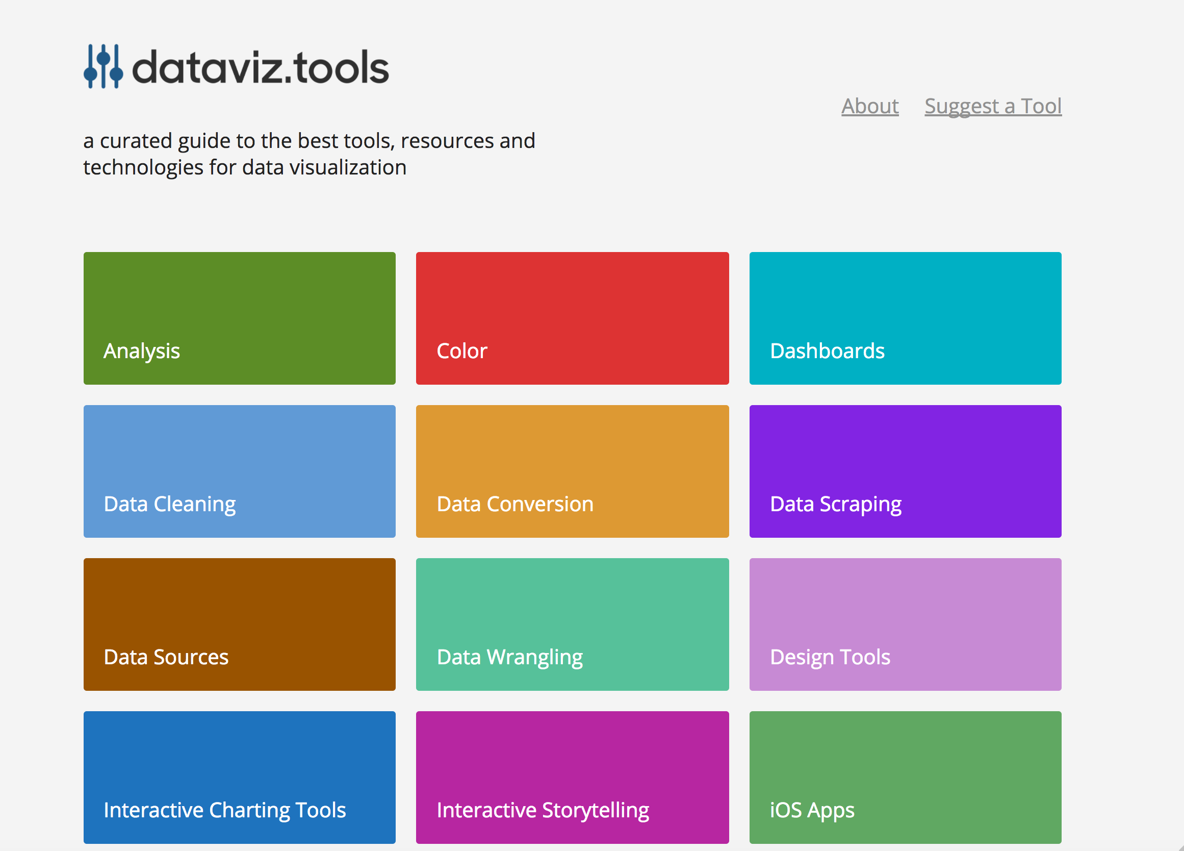 dataviz.tools▲409
Curated collection of the 400 best data visualization tools
2017 · dataviz.tools · its alternatives →
- 4

- 5AC
I'm making a coloring book of data structures and algorithms for programmers and students. So far I have a prototype page for a sorting algorithm (albeit a rather simple one). Here the Selection Sort coloring pages you can print. https://coderscoloringbook.com/selectionsort And here is how I colored mine. https://coderscoloringbook.com/selectionsortcolored A coloring book is not quite enough to teach algorithms on its own, but I really get a lot from visual reinforcement of what I learn from books/lectures. Do you think having coloring pages like this could…
2017 · its alternatives →
- 6

- 7

- 8

Hi HN! I'm Gabriel, the author of dep-tree (https://github.com/gabotechs/dep-tree), and I wanted to show off this tool and explain why it's being really useful at my current org for dealing with code complexity. I work at a startup where business evolves really fast, and requirements change frequently, so it's easy to end up with big piles of code stacked together without a clear structure, specially with tight deadlines. I made dep-tree [1] to help us maintain a clean code architecture and a logical separation of concerns between parts of the application, which is…
2024 · github.com · its alternatives →
- 9

A simple Python debugger and profiler that generates animated visualizations of program flow, useful for algorithm learning. - CCExtractor/vardbg
2020 · github.com · its alternatives →
- 10

A tool to create animated graph visualizations, based on graphviz. - GitHub - mapio/GraphvizAnim: A tool to create animated graph visualizations, based on graphviz.
2016 · github.com · its alternatives →
- 11

Turn codebases into interactive maps, graphs, and governance
Jul 2026 · dev-swat.com · its alternatives →
- 12

Visual explanations of Algorithms and Data structures
2020 · chrislaux.com · its alternatives →
- 13
 ADS-B visualizer▲339
I've created a web app for querying and visualization of ADS-B datasets: https://adsb.exposed/ Source code: https://github.com/ClickHouse/adsb.exposed/ The results significantly exceeded my expectations because the pictures are insanely beautiful, and the data is a treasure trove. It proves many statements that were not certain: - it is feasible to generate tiles by aggregation on a pixel level (instead of hexagons or rectangular grid); - it does not require JPG/PNG tiles - we can transfer raw bitmap data with zstd compression; - it is possible to…
2024 · adsb.exposed · its alternatives →
- 14

I explored an alternative way to view codebases to the typical folder/file list, showing a bird's-eye-view of its structure. https://octo.github.com/projects/repo-visualization
2021 · octo.github.com · its alternatives →
- 15

- 16

Creating data visualizations with AI nowadays often means chat, chat and more chats...and writing long prompts can be annoying while they are also not the most effective way to describe your visualization designs. Data Formulator blends UI interaction with natural language so that you can create visualizations with AI much more effectively! You can: * create rich visualizations beyond initial datasets, where AI helps transforming and visualizing data along the way * iterate your designs and dive deeper using data threads, a new way to manage your conversation with AI. Here is a demo video:…
2024 · github.com · its alternatives →
- 17

Layout is a rust library and a tool that renders Graphviz dot files. - nadavrot/layout
2022 · github.com · its alternatives →
- 18

2020 · algoviz.njanjo.com · its alternatives →
- 19

Codemap visualizes any codebase as a graph for software engineers to quickly understand the code architecture. Supports Typescript, Python, Java, PHP, Ruby, Go (Golang), and Terraform.
2020 · codemap.app · its alternatives →
- 20

Interactive Data Structure & Algorithm Visualizerr
2025 · dsavisualizer.in · its alternatives →
- 21VS
2017 · lelandbatey.com · its alternatives →
- 22GP
2016 · veniversum.github.io · its alternatives →
- 23

Visualize, learn and explore algorithms
2024 · algorithmvisualizersuite.blogspot.com · its alternatives →
- 24

2017 · zwischenzugs.com · its alternatives →
Also compare
Ranked by how close each launch is in meaning, then by votes. Prices were read from each product’s own site when checked and can change. Refine with your own description →