Dev tools · alternatives · 2026

24 alternatives to ADS-B visualizer
I've created a web app for querying and visualization of ADS-B datasets: https://adsb.exposed/ Source code: https://github.com/ClickHouse/adsb.exposed/ The results significantly exceeded my expectations because the pictures are insanely beautiful, and the data is a treasure trove. It proves many statements that were not certain: - it is feasible to generate tiles by aggregation on a pixel level (instead of hexagons or rectangular grid); - it does not require JPG/PNG tiles - we can transfer raw bitmap data with zstd compression; - it is possible to…
ADS-B visualizer is a web application for querying and exploring aircraft tracking data collected through ADS-B signals. It is designed for users interested in aviation data analysis and visualization. The tool uses… Below are 24 products that do a similar job, ranked by how close each is in meaning and then by launch-day votes. Prices are shown for the 1 we have checked on their own sites, 1 of them free or with a free tier. ADS-B visualizer launched in 2024; newer entries below may have overtaken it.
- 1IM
Hey HN! Pilots everywhere are required to keep a logbook of all their flying hours, aircraft, airports, and so on. Since I track everything digitally (some people still just use paper logbooks!), I put together some data visualizations and a few 3D globes to show my flying history. This globe is probably my favourite so far: https://jameshard.ing/pilot/globes/all If you’ve got ideas for other graphs or ways to show this kind of data, I’d love to hear them!
2025 · jameshard.ing · its alternatives →
- 2

Write down your algorithm to be visualized
2016 · jasonpark.me · its alternatives →
- 3

Hello, I'd like to share a 3D plane tracking web app that I developed called: skies-adsb. Living near KMIA (a very busy airport), I spend a lot of time plane spotting and thought it would be cool to track planes in 3D. In October 2021, I built a prototype 3D ADS-B flight tracker called skies-adsb using p5.js. In April 2022, I released version 1.0 of skies-adsb, rewritten in Three.js. However, this release still relied on manual editing of GeoJSON layers. By late 2024, I had learned enough about GIS and GeoPandas to automate map creation using custom GeoJSON layers. During the Christmas…
2025 · github.com · its alternatives →
- 4

- 5
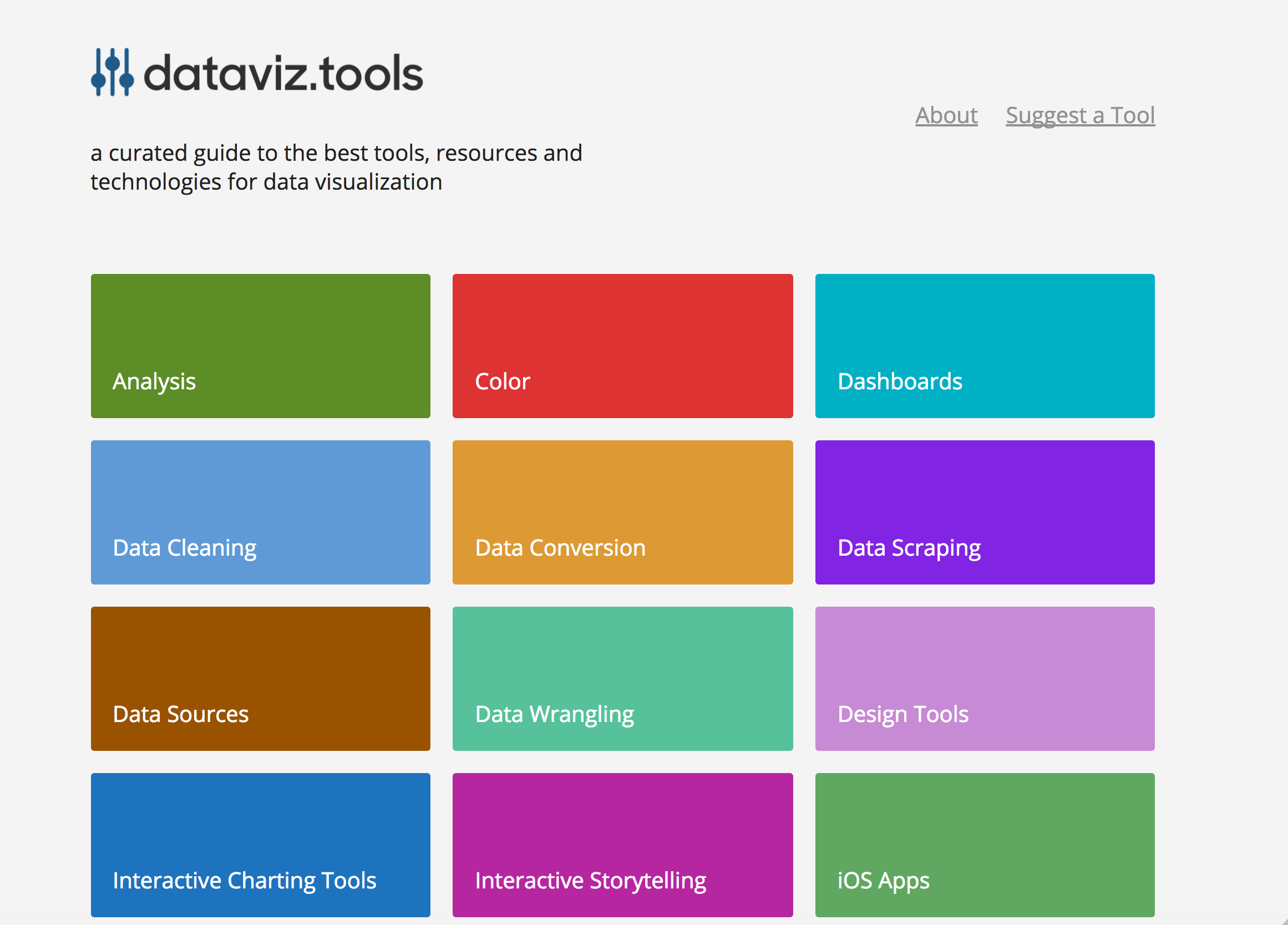 dataviz.tools▲409
Curated collection of the 400 best data visualization tools
2017 · dataviz.tools · its alternatives →
- 6
 VisualSitemaps▲512
Autogenerate visual sitemaps in seconds.
2019 · visualsitemaps.com · its alternatives →
- 7

Hey there, I'm a big fan of the game Factorio and the beauty of factories in the game. That's why I created a website to artfully visualize Factorio blueprints a few years ago. With the new 2.0 update, a few things broke. I took the opportunity to rewrite everything from Python to JavaScript and support Factorio 2.0 and the Space Age DLC. It's now also possible to easily modify the style of the drawings. Let me know if you find any bugs or if you have ideas for features.
2025 · github.com · its alternatives →
- 8

I built a real-time flight tracker that renders 10,000+ aircraft on an interactive 3D globe, entirely in the browser using Rust compiled to WebAssembly.
Apr 2026 · flight-viz.com · its alternatives →
- 9IB
grafar is a JavaScript library for creating visualizations on the web, with 3D support via WebGL. Built for mathematical plotting, but also can also handle data visualization.
2021 · thoughtspile.github.io · its alternatives →
- 10

My co-worker and I were debugging a SQL issue; having not seen SQL in two years, I embarrassed myself by confusing union vs. join. After this episode, I tried refreshing my SQL memory, but there are few websites that animate SQL for you. Most of them just have a series of images to help you visualize. There are a few tools that are quite good and robust (especially for large/complex use cases) but require installation and are too complex for my simple purpose. So, just created a small tool to help visualise SQL. Most of the animations are just my understanding of how SQL works. Would…
2022 · animatesql.com · its alternatives →
- 11
 Adsata▲72
Webcam eyetracking studies for exploring visual interaction
2021 · adsata.com · its alternatives →
- 12

Pathfinding visualizer on a real map, anywhere in the world
2024 · honzaap.github.io · its alternatives →
- 13
 Viewst▲283
Create professionally‑designed ads from scratch in minutes
2020 · viewst.com · its alternatives →
- 14

Sup HN, So I got tired of bouncing between Flightradar, MarineTraffic, and Twitter every time something kicked off globally, so I wrote a dashboard to aggregate it all locally. It’s called Shadowbroker. I’ll admit I leaned way too hard into the "movie hacker" aesthetic for the UI, but the actual pipeline underneath is real. It pulls commercial/military ADS-B, the AIS WebSocket stream (about 25,000+ ships), N2YO satellite telemetry, and GDELT conflict data into a single MapLibre instance. Getting this to run without melting my browser was the hardest part. I'm running this on a laptop…
Mar 2026 · github.com · its alternatives →
- 15

Creating data visualizations with AI nowadays often means chat, chat and more chats...and writing long prompts can be annoying while they are also not the most effective way to describe your visualization designs. Data Formulator blends UI interaction with natural language so that you can create visualizations with AI much more effectively! You can: * create rich visualizations beyond initial datasets, where AI helps transforming and visualizing data along the way * iterate your designs and dive deeper using data threads, a new way to manage your conversation with AI. Here is a demo video:…
2024 · github.com · its alternatives →
- 16

Engineer - Hacker - Technology Addict
2014 · jackhanford.com · its alternatives →
- 17

I've been iterating on a small galaxy visualization project that originally started as a university course assignment, using only provided sample data (no real astronomical distances). Recently, I updated it to include redshift-based distance data, which makes the 3D structure more meaningful and closer to real large-scale galaxy distributions. Repo: https://github.com/Avicted/galaxy_visualization_raylib Demo video (3D navigation + galaxy structures): https://www.youtube.com/watch?v=fC83RDWuPvw Current state: - Written in C (C99 standard) using Raylib -…
2024 · github.com · its alternatives →
- 18

Hey everyone, I've made this website that I hope can help some people. The original inspiration comes from being tired of having a specific site (and finding it!!) that serves my needs for a single purpose. Straight forward tools, no fuss. The objective is to be fully in-browser, no login and if possible without contacting a remote server. PGP Key Analyser - Analyze PGP keys directly in your browser - finally I can see the infos without having to download the key on my device Proton Date - Check ProtonMail account creation dates - pretty niche I admit Favicon Hash - Generate website favicon…
2025 · kriztalz.sh · its alternatives →
- 19

Decided to remake my old pathfinding project to hexagonal tiles. Pretty happy with how it turned out. Source code: https://github.com/honzaap/Pathfinding
2022 · honzaap.github.io · its alternatives →
- 20

Hello, guys~ I recently developed a data exploration and visualization app which can be used as a different type of open-source alternative to Tableau. It is extremely easy to embed in your apps just as a react component. The original purpose is to develop a lite plugin that can be easily embedded in most cases, it doesn't have to be a large BI, but a lite graphic plugin. GitHub: Kanaries/graphic-walker, https://github.com/Kanaries/graphic-walker The main features implemented: * A user-friendly drag-and-drop-based interaction for exploratory data analysis with…
2023 · github.com · its alternatives →
- 21
- 22

- 23

Web app that visualizes data structures in action
2025 · datastructuresvisualization.netlify.app · its alternatives →
- 24

2020 · algoviz.njanjo.com · its alternatives →
Also compare
Ranked by how close each launch is in meaning, then by votes. Prices were read from each product’s own site when checked and can change. Refine with your own description →