Dev tools · alternatives · 2026

24 alternatives to Responsive Viewer
View multiple screen dimensions in one view
Responsive Viewer is a Chrome extension that displays multiple screen dimensions simultaneously in a single view. Designed for front-end developers, it simplifies testing responsive websites and applications across… Below are 24 products that do a similar job, ranked by how close each is in meaning and then by launch-day votes. Responsive Viewer launched in 2019; newer entries below may have overtaken it.
- 1
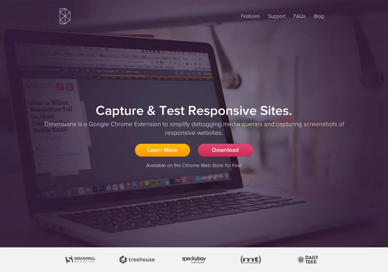
Chrome Extension for designers to test responsive websites.
2014 · its alternatives →
- 2

- 3

Take responsive screenshots with the click of a button
2017 · its alternatives →
- 4
 Am I Responsive▲108
see your website in multiple screen resolutions
2014 · fireship.dev · its alternatives →
- 5

- 6
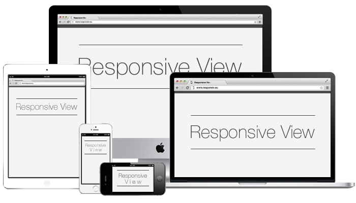 Responsive View▲216
Test your responsive design across different devices
2016 · responsiv.eu · its alternatives →
- 7

Check how responsive is your website across device sizes
2018 · its alternatives →
- 8
 ViewedIt▲330
Record your screen, share & know instantly when people watch
2016 · vidyard.com · its alternatives →
- 9
 Screen Size Map▲206
An interactive map of screen sizes for responsive web design
2019 · screensizemap.com · its alternatives →
- 10

New Chrome extension to monitor a website/area of a website
2014 · chromewebstore.google.com · its alternatives →
- 11

Chrome's image viewer, but with zoom, pan, and more
Dec 2025 · its alternatives →
- 12

- 13
 Dimensions▲124
A Chrome extension to measure anything
2014 · chromewebstore.google.com · its alternatives →
- 14

Hey HN! We do a lot of frontend testing, and one thing we find frustrating is the limited tooling available to observe how a URL renders on different viewports/devices simultaneously. For example, we can use Chrome Inspector's "Device" previews, but we run into the following: - Chrome doesn't keep those devices/viewports up to date, and adding new ones is pretty annoying (we've open sourced our collection of 180+ viewports/dimensions under MIT). - You can’t see multiple viewports at once (and it’s cumbersome switching back and forth) - When you notice a problem, there's no…
2024 · viewport-tester.com · its alternatives →
- 15
 LT Browser 2.0▲182
Experience 6X faster responsive web development
2023 · testmuai.com · its alternatives →
- 16

Design beautiful web apps for any screen size.
2022 · its alternatives →
- 17
 U-Eyes▲121
A Chrome Extension for simulating and capture mobile view
2023 · eyeballer.dev · its alternatives →
- 18
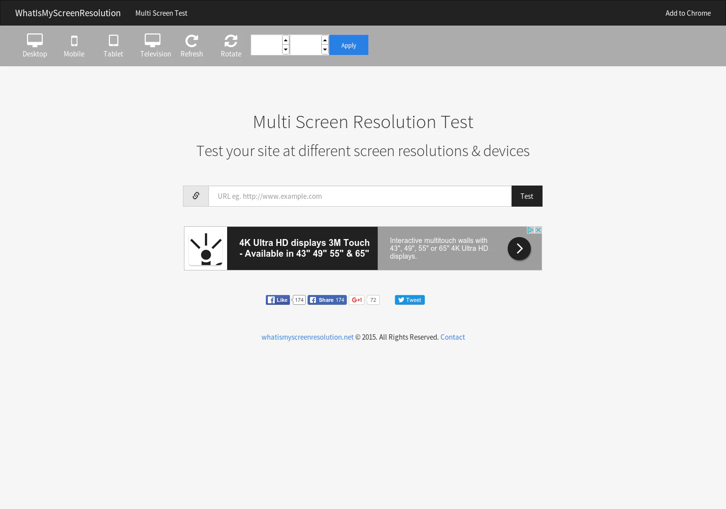
Test your site at different screen resolutions & devices.
2015 · its alternatives →
- 19RV
2012 · dfcb.github.com · its alternatives →
- 20
 UltraWideo▲61
It manipulates video aspect ratio to fit your entire screen.
2018 · github.com · its alternatives →
- 21

Made to measure. Built for everything else.
2024 · chromewebstore.google.com · its alternatives →
- 22

The next generation of responsive images
2023 · github.com · its alternatives →
- 23

See how a webpage renders across many browsers & devices
2018 · chromewebstore.google.com · its alternatives →
- 24

It's exactly that... responsive pixel art 🙃
2016 · pixel.essenmitsosse.de · its alternatives →
Also compare
Ranked by how close each launch is in meaning, then by votes. Prices were read from each product’s own site when checked and can change. Refine with your own description →