
Am I Responsive
see your website in multiple screen resolutions
Am I Responsive launched on August 1, 2014 with 108 votes, #253 of 2,208 launches that month and more than 75% of that year's launches. The site was still online in September 2026, 12 years on.
What it does
Show off how responsive design looks across different browsers easily with this 4 in 1 viewport tool. See how your site looks on desktop, laptop, ipad & iphone.
I take a lot of screen shots of the various device breakpoints for responsive design and it takes a while to prepare them. This tools allows me to get what I need quickly, and hopefully it can be helpful for showing your more visual clients what you mean by responsive design when a suite of products isn’t at the ready. This is not a tool for testing, it is really important that you do that on real devices. This instead is a tool for quick screenshots (for me) and to visually allow people to “get” what you mean in client meetings. The viewports I have chosen are based on the devices that were a part of the responsive PSD layout I previously bought, and yes they are all Apple. Apologies to…from fireship.dev
Does a similar job
all alternatives →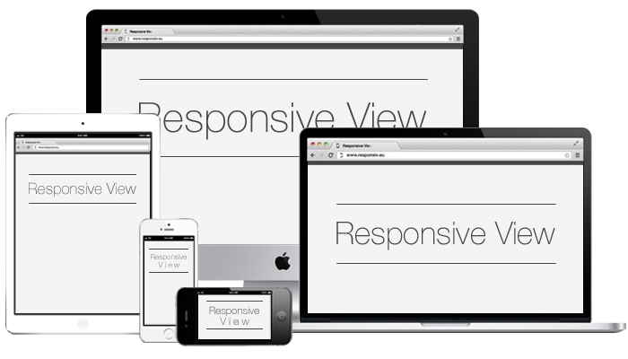



 Responder2017 · chromewebstore.google.com · ▲234
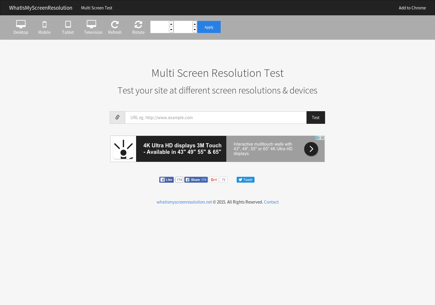
Displays the websites grid and the width/height when resized
More life & fun this month
the category →
A free city-building game in your browser. You are the mayor. You know what the city needs. Now get it past the zoning board, the neighbors, the appeals court and the next election.
Life & fun · 1d ago · permit.petercai.com
- IV
Life & fun · 13d ago · tanzaniaeducationproject.org

Turn a phone, tablet or TV into a sign. Type a message and it fills the screen: welcome signs, timers, Wi-Fi passwords and more. No app, no account, free.
Life & fun · 14d ago · bigwords.page

Play a free virtual guitar online with your keyboard or by touch. Slow songs down and see every chord, string and strum. Acoustic, classic, electric and bass.
Life & fun · 8d ago · guitoro.com

Carrier settings from iPhone, Pixel and Galaxy firmware, decoded and compared: APNs, VoLTE, 5G and Wi-Fi Calling per carrier, and what each build changed.
Life & fun · 12d ago · carrierexplode.com

Life & fun · 22d ago · space.bl2.net
Source: Product Hunt launch ↗
Launched alongside, August 2014
the whole month →

GlassWire is a modern personal firewall and network monitor with over 54 million downloads. Download GlassWire free!
Life & fun · 2014 · glasswire.com

- PG
Life & fun · 2014 · gifyoutube.com

Make stuff with us. Signup for early access to the PH API :)
Dev tools · 2014
