Dev tools · alternatives · 2026

24 alternatives to Visualize communities in your GitHub following network graph
Below are 24 products that do a similar job, ranked by how close each is in meaning and then by launch-day votes. Visualize communities in your GitHub following network graph launched in 2016; newer entries below may have overtaken it.
- 1
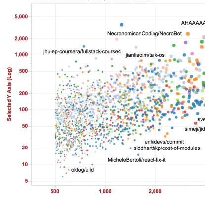
- 2

- 3
 Git Skyline▲142
A 3D visualization of your Git contributions
2024 · git-skyline.huakun.tech · its alternatives →
- 4

Tool for visualizing GitHub profiles. Contribute to tipsy/profile-summary-for-github development by creating an account on GitHub.
2017 · github.com · its alternatives →
- 5

Show your GitHub contributions graph on your iOS Devices
2016 · github.com · its alternatives →
- 6

View and print a 3D model of your GitHub contribution graph
2021 · skyline.github.com · its alternatives →
- 7

- 8

Visualize GitHub's most popular repos. http://www.donnemartin.com/viz - donnemartin/viz
2016 · github.com · its alternatives →
- 9

2016 · oracleofnj.github.io · its alternatives →
- 10

Graph of subreddits. Contribute to ghgr/reddit-graph development by creating an account on GitHub.
2018 · github.com · its alternatives →
- 11
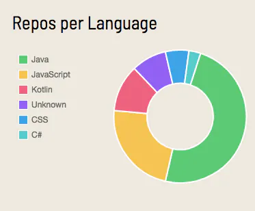
- 12

Tool for visualizing GitHub profiles
2018 · profile-summary-for-github.com · its alternatives →
- 13
 GitHub Tree▲151
Visualize repo structures in tree view.
2025 · githubtree.mgks.dev · its alternatives →
- 14

- 15
 Forkest▲61
Turn your GitHub contributions into a pixel-art garden
28d ago · forkest.dev · its alternatives →
- 16

Hi HN! Excited to show another gamification way of visualize github contribution graph!
Jan 2026 · github.com · its alternatives →
- 17

2012 · aaronparecki.com · its alternatives →
- 18

An attempt to visualize and explore the trending of OSS repo in Github
2022 · github.com · its alternatives →
- 19GP
2016 · veniversum.github.io · its alternatives →
- 20
 Frankly▲101
A dashboard of issues and PRs across GitHub repositories.
2016 · github.com · its alternatives →
- 21GT
- 22

Stream Deck plugin displays your GitHub contributions graph.
2024 · marketplace.elgato.com · its alternatives →
- 23TechStacks▲12
Tree visualization of popular web dev Github repos
2024 · tech-stacks.vercel.app · its alternatives →
- 24

2012 · github.com · its alternatives →

Also compare
Ranked by how close each launch is in meaning, then by votes. Prices were read from each product’s own site when checked and can change. Refine with your own description →