Life & fun · alternatives · 2026
24 alternatives to An interactive map of US lighthouses and navigational aids
This is an interactive map of US navigational aids and lighthouses, which indicates their location, color, characteristic and any remarks the Coast Guard has attached. I was sick at home with the flu this weekend, and went on a bit of a Wikipedia deep dive about active American lighthouses. Searching around a bit, it was very hard to find a single source or interactive map of active beacons, and a description of what the "characteristic" meant. The Coast Guard maintains a list of active lights though, that they publish annually…
An interactive map displaying active US lighthouses and navigational aids maintained by the Coast Guard. The tool shows each beacon's location, color, characteristic, and official remarks, with animated visualizations… Below are 24 products that do a similar job, ranked by how close each is in meaning and then by launch-day votes.
- 1

- 2

The quickest and easiest territory mapping software that you ever used. Trusted by more than 1000 customers for data-driven decisions
2018 · oalley.net · its alternatives →
- 3

For the past few months, I've been working on a website that answers two different questions: - Where in my city have the best travel times to all the things and people I care about? - Given a listing, how far is it from all the things and people I care about? Personally this was fueled by my own frustrations when I was apartment hunting in NYC. I was frustrating to have to juggle so many Google Maps tabs when I was evaluating a listing, and it was also annoying to not have full confidence that I was even searching in the right places. I wanted to be close to work, a Trader Joe's, and a…
2025 · theretowhere.com · its alternatives →
- 4

- 5
 Lighthouse 8.0▲330
Analyze web apps & sites, collect modern performance metrics
2021 · developer.chrome.com · its alternatives →
- 6

Atlas is the AI-native GIS. Build maps, dashboards, and spatial workflows from a conversation — GIS-grade analysis, accessible to your whole team. Trusted by energy developers, asset managers, and field operations teams.
2024 · atlas.co · its alternatives →
- 7
 Litmaps▲104
Search scientific literature with interactive citation maps
2021 · litmaps.com · its alternatives →
- 8

- 9

I got tired of Googling basic course info, so I made a free directory of every US course Google filters for golf course results are terrible so I built a better way to browse courses using OSM as the backbone.... https://golfcoursebrowser.com/ It's a work in progress and mostly US for now, but I want to expand to the rest of North America, the EU, and the rest of the world ASAP. It's free, no ads, no login, no bs. If you spot anything wrong (bad info, a missing course, wrong scorecard), you can flag it right on the course page. I actually read those and fix them. Still a lot…
Jul 2026 · golfcoursebrowser.com · its alternatives →
- 10IE
2017 · mjmdavis.com · its alternatives →
- 11

Your Literature Review Assistant — Discover literature and accelerate your entire research process with the most powerful visual search tool.
2021 · app.litmaps.co · its alternatives →
- 12

- 13

This is a service I've built to provide equirectangular cloud maps of the whole Earth, updated every 3 hours, for free. It's based on infrared and visible light data from EUMETSAT, processed to enhance the clouds and try to reduce the impact of surface temperatures on the final image. I built it because it's surprisingly hard to find these kinds of images in a format that's useful to developers and hobbyists. I was building a 3D ISS tracker and wanted to include live clouds but couldn't find anything good, so I got sidetracked, and here we are.
2023 · github.com · its alternatives →
- 14

- 15MF
I downloaded the MSHA's (Mine Safety and Health Administration) public datasets and create a visualization of all the mines in the US complete with the operators and details on each site.
Feb 2026 · mines.fyi · its alternatives →
- 16MO
2018 · anvaka.github.io · its alternatives →
- 17
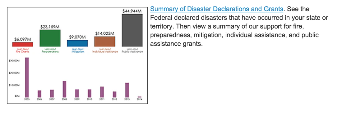
- 18

Beautiful wall map filled with fascinating world facts
2016 · kickstarter.com · its alternatives →
- 19

A data aware UI components library for building realtime maps - reactivemaps/README.md at master · appbaseio/reactivemaps
2017 · github.com · its alternatives →
- 20

Maps, geocoding, search, routing, and navigation APIs built on transparent pricing and privacy-first infrastructure.
2018 · stadiamaps.com · its alternatives →
- 21
 Litmaps▲87
A visual workspace to discover and create quality research
2022 · litmaps.com · its alternatives →
- 22AM
2014 · projectjefferson.com · its alternatives →
- 23

Hey HN, jvaclavik here from OpenClimbing team! We are thrilled to release version 2.0 of our fully opensource/opendata climbing guide. Based on OpenStreetMap for map-data and Wikimedia Commons for images, we created a (hopefully) user-friendly app which completely uses these open databases, thus contributing data back to commons. We designed a simple and powerful notation for drawing climbing routes directly over the Wikimedia pictures: - https://wiki.openstreetmap.org/wiki/Key:wikimedia_commons:pa... Check out the release article for a ton of new features, or go…
2014 · openstreetmap.org · its alternatives →
- 24

An evolving, nationwide map of the outdoors
2015 · naturalatlas.com · its alternatives →
Also compare
Ranked by how close each launch is in meaning, then by votes. Prices were read from each product’s own site when checked and can change. Refine with your own description →