Life & fun · alternatives · 2026
24 alternatives to DataFart - easy command line graphing
DataFart is a command-line tool for creating graphs. It allows users to generate visualizations directly from the terminal without requiring complex setup or graphical interfaces. The product is designed for developers… Below are 24 products that do a similar job, ranked by how close each is in meaning and then by launch-day votes. Prices are shown for the 1 we have checked on their own sites, 1 of them free or with a free tier. DataFart - easy command line graphing launched in 2012; newer entries below may have overtaken it.
- 1GA
2019 · tailgraph.live · its alternatives →
- 2

- 3

Flexible command line tool to create graphs from CSV data - mcastorina/graph-cli
2018 · github.com · its alternatives →
- 4
 Chartbrew v2▲197
Visualize data from all your data sources in one place
2022 · chartbrew.com · its alternatives →
- 5

Create pro-level graphs that drive actions
2024 · graphy.app · its alternatives →
- 6SS
2014 · seenaburns.github.io · its alternatives →
- 7
 MRRArt Pro▲568
Create beautiful text charts (ascii) from your data
2023 · mrrartpro.com · its alternatives →
- 8

Make bar charts on the terminal. Contribute to TurkeyMcMac/barchart development by creating an account on GitHub.
2021 · github.com · its alternatives →
- 9

- 10

- 11DA
Dear HN, I am Riwaj, the cofounder of dstack.ai (https://github.com/dstackai). A few months ago, we built an online service that allows users to publish data visualizations from Python or R. The idea was to build a tool that did not require additional programming or front-end development for publishing data visualizations. Such a code can be invoked from either Jupyter notebook, RMarkdown, Python, or R scripts. Once the data is pushed, it can be accessed via a browser. Open-sourcing dstack: During our customer discovery phase, we realized that dstack.ai should integrate a lot…
2020 · its alternatives →
- 12

A simple Python debugger and profiler that generates animated visualizations of program flow, useful for algorithm learning. - CCExtractor/vardbg
2020 · github.com · its alternatives →
- 13
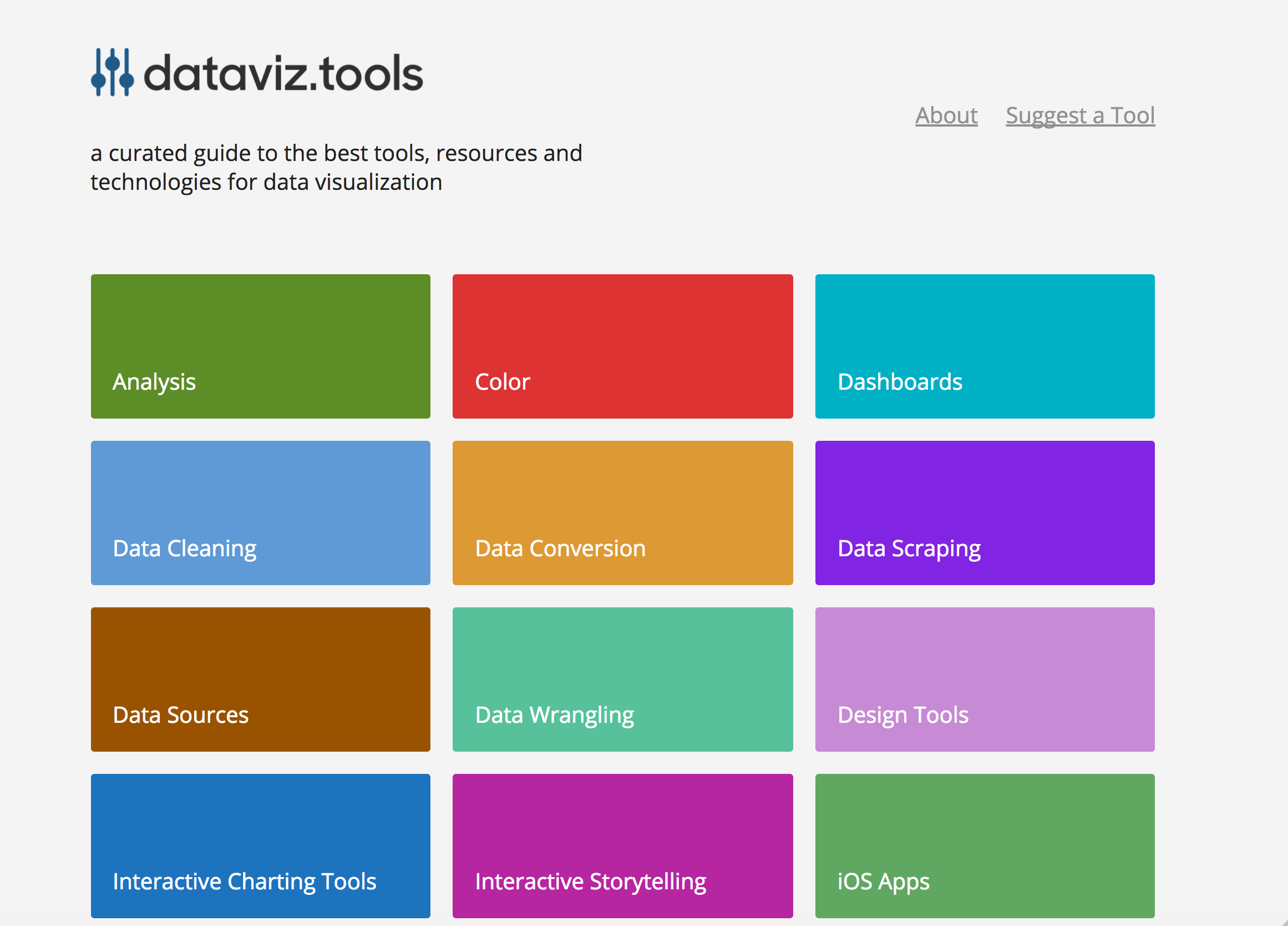 dataviz.tools▲409
Curated collection of the 400 best data visualization tools
2017 · dataviz.tools · its alternatives →
- 14
- 15

Creating data visualizations with AI nowadays often means chat, chat and more chats...and writing long prompts can be annoying while they are also not the most effective way to describe your visualization designs. Data Formulator blends UI interaction with natural language so that you can create visualizations with AI much more effectively! You can: * create rich visualizations beyond initial datasets, where AI helps transforming and visualizing data along the way * iterate your designs and dive deeper using data threads, a new way to manage your conversation with AI. Here is a demo video:…
2024 · github.com · its alternatives →
- 16CT
2018 · stagraph.com · its alternatives →
- 17DP
Data Painter is RATH's new feature to interact with your data. It helps you to specify complex visual patterns and find explanations and potential causals. It allows you to do on-flight data labeling, cleaning or even create new features does not exited in original dataset. Everything can be done with a brush tool(painter), You can even play with your data with your fingers on mobile. RATH is an open-source alternative to Tableau, but with more automations. Feedbacks and suggestions are appreciated. RATH's Github: https://github.com/Kanaries/Rath RATH's HomePage:…
2023 · docs.kanaries.net · its alternatives →
- 18

A syntax-highlighting pager for git, diff, grep, rg --json, and blame output - dandavison/delta
2020 · github.com · its alternatives →
- 19
 Chartbrew v3▲162
Create connected client reports effortlessly
2024 · chartbrew.com · its alternatives →
- 20
 Chartbrew▲159
One dashboard to view, create and share your data
2020 · chartbrew.com · its alternatives →
- 21

- 22
 ChartBrick▲120
Create charts using your databases from Notion or Airtable
2022 · chartbrick.com · its alternatives →
- 23

An awesome iTerm2 backend for Matplotlib, so you can plot directly in your terminal. - daleroberts/itermplot
2017 · github.com · its alternatives →
- 24

GUI disk analyzers are great for figuring out what's filling up your laptop/desktop drive. On containers or remote servers, the options are limited to purely text based utilities (e.g. du) or list-centric TUIs (e.g. ncdu) which are usually limited to viewing one directory at a time. I created leaves to fill that gap. Inspired by classic utilities like WinDirStat and KDirStat, it uses a 2-dimensional treemap^1 visualization to show the entire directory hierarchy with proportionally sized rectangles. It's performant enough to handle millions of files, thanks to Rust and multi-threading.…
Jul 2026 · github.com · its alternatives →
Also compare
Ranked by how close each launch is in meaning, then by votes. Prices were read from each product’s own site when checked and can change. Refine with your own description →