Life & fun · alternatives · 2026
24 alternatives to Graph Visualization of Financial Correlations
An attempt to show which financial products are highly correlated, negatively correlated, or non-correlated in an easily understood visual way. Implemented using D3 force-layout, based on daily financial data generated by Google Sheet GOOGLEFINANCE function.
Below are 24 products that do a similar job, ranked by how close each is in meaning and then by launch-day votes. Graph Visualization of Financial Correlations launched in 2023; newer entries below may have overtaken it.
- 1

Create pro-level graphs that drive actions
2024 · graphy.app · its alternatives →
- 2
the one page visual model to understand financial statements
2016 · amazon.com · its alternatives →
- 3

Many JS libraries exist to build graphs on the web (Vega, chartJS, Plotly...). They allow to make charts quickly. But you lose flexibility: you're limited by the options they offer. I just created a gallery with hundreds of graphs made with d3.js and React. - Examples are split by graph types - They all come with explanation and code sandboxes - Gradual complexity to ease the learning curve It took me ages to create this project! Feedback welcome!
2023 · react-graph-gallery.com · its alternatives →
- 4

- 5
 TradingView▲300
The best charting tool for crypto and stocks
2014 · tradingview.com · its alternatives →
- 6IT
Experiments in expressing statistical thinking with interactive design
2015 · r2d3.us · its alternatives →
- 7VG
2020 · treksit.netlify.app · its alternatives →
- 8F3
2022 · fintopea.com · its alternatives →
- 9

GitHub Gist: instantly share code, notes, and snippets.
2013 · bl.ocks.org · its alternatives →
- 10

- 11
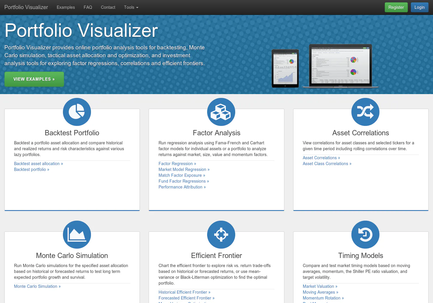
An index investor's dream come true
2014 · portfoliovisualizer.com · its alternatives →
- 12

Comprehensive ICO funding data and visualizations
2017 · coindesk.com · its alternatives →
- 13
 Variance▲91
Build powerful data visualizations for the web.
2014 · variancecharts.com · its alternatives →
- 14

- 15
 HyperCharts▲91
Clear financials and business metrics of public companies
2019 · hypercharts.co · its alternatives →
- 16GA
Hi everyone! Graphs is the intersection of data visualization and the daily web puzzle genre (Wordle, NYT Mini Crossword, Connections, etc.). Every day, you are given a nameless graph and 5 options to select the right dataset it is representing. Upon winning, you can access the underlying dataset and other info + maintain a streak and stats. It's super simple - check out today's chart and you should be able to get the gist quickly. My email + twitter account (@graphsgame) is on the page, would love a feedback or a follow. Don't hesitate to reach out!
2024 · graphs.world · its alternatives →
- 17
- 18

- 19

Effortlessly visualize JSON structures as dynamic tree diagrams - The-01-Company/jsontr.ee
2024 · github.com · its alternatives →
- 20

- 21CV
2018 · correlate.pro · its alternatives →
- 22ND
2014 · blog.spritesapp.com · its alternatives →
- 23

- 24

The ultimate tool to visualize trends in multi-timeframe
2023 · jp.tradingview.com · its alternatives →
Also compare
Ranked by how close each launch is in meaning, then by votes. Prices were read from each product’s own site when checked and can change. Refine with your own description →