Commerce · alternatives · 2026

24 alternatives to Signals Hidden in the Bond Market
Visual scenarios showing what fixed income is pricing next
Below are 24 products that do a similar job, ranked by how close each is in meaning and then by launch-day votes.
- 1

Here's a little side project I’ve been working on: https://totalrealreturns.com/ The Total Real Returns chart demonstrates the preservation or growth of real wealth more clearly than conventional (nominal-dollar, price-only) stock charts, because: (1) we include the effects of inflation-diminished purchasing power, and (2) we include the effects of reinvesting dividends from the initial investment. I found it harder to explain the y-axis in words than it was to do the math, so please let me know if you think the "baguettes" explanation on the homepage helps. I was up until 4am…
2022 · totalrealreturns.com · its alternatives →
- 2
 TradingView▲300
The best charting tool for crypto and stocks
2014 · tradingview.com · its alternatives →
- 3
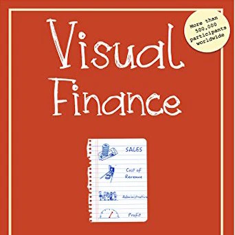
the one page visual model to understand financial statements
2016 · amazon.com · its alternatives →
- 4
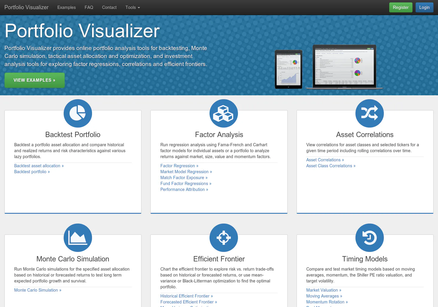
An index investor's dream come true
2014 · portfoliovisualizer.com · its alternatives →
- 5

All-in-one dashboard to manage your DeFi Liquidity Pools
2020 · liquidity.vision · its alternatives →
- 6
 Bubble Screener▲123
Interactive bubble charts for stock markets
2024 · bubblescreener.com · its alternatives →
- 7
 RateBunni▲107
Avoid manipulated media to find the right bank for you
2021 · ratebunni.com · its alternatives →
- 8

- 9CO
2020 · quiverquant.com · its alternatives →
- 10
 Market Map▲108
Explore the universe of publicly traded companies
2023 · marketmap.one · its alternatives →
- 11TS
2017 · tokenspread.com · its alternatives →
- 12AY
2017 · terminal.quantra.io · its alternatives →
- 13

- 14

The ultimate tool to visualize trends in multi-timeframe
2023 · jp.tradingview.com · its alternatives →
- 15GV
An attempt to show which financial products are highly correlated, negatively correlated, or non-correlated in an easily understood visual way. Implemented using D3 force-layout, based on daily financial data generated by Google Sheet GOOGLEFINANCE function.
2023 · observablehq.com · its alternatives →
- 16

Visualize your financial future with compound interest
2025 · interactive-compound-2dup.bolt.host · its alternatives →
- 17

- 18SM
https://www.forestpin.com/cse/ This is still experimental and is a different way of analyzing stocks in the long term. We consider Dividends, Rights Issues, Bonus Issues, and Splits to calculate the value of the share. This gives a more realistic view than simply looking at the share price variations. We reinvest cash from dividends in the same stock and sell existing shares to execute rights. It's a simple calculation but it gives a much better perspective of the stocks in the long term than simply looking at the share price. You can select a stock symbol or click on…
2016 · its alternatives →
- 19

The live visual map of prediction markets
Aug 2026 · predictionbubbles.net · its alternatives →
- 20CV
2018 · correlate.pro · its alternatives →
- 21

- 22

See most recent buy and sell signals in the market.
2024 · niyo.link · its alternatives →
- 23

- 24

One screen. Every market. Live. Free. No sign up. No login.
Jun 2026 · gmdmarkets.com · its alternatives →
Also compare
Ranked by how close each launch is in meaning, then by votes. Prices were read from each product’s own site when checked and can change. Refine with your own description →