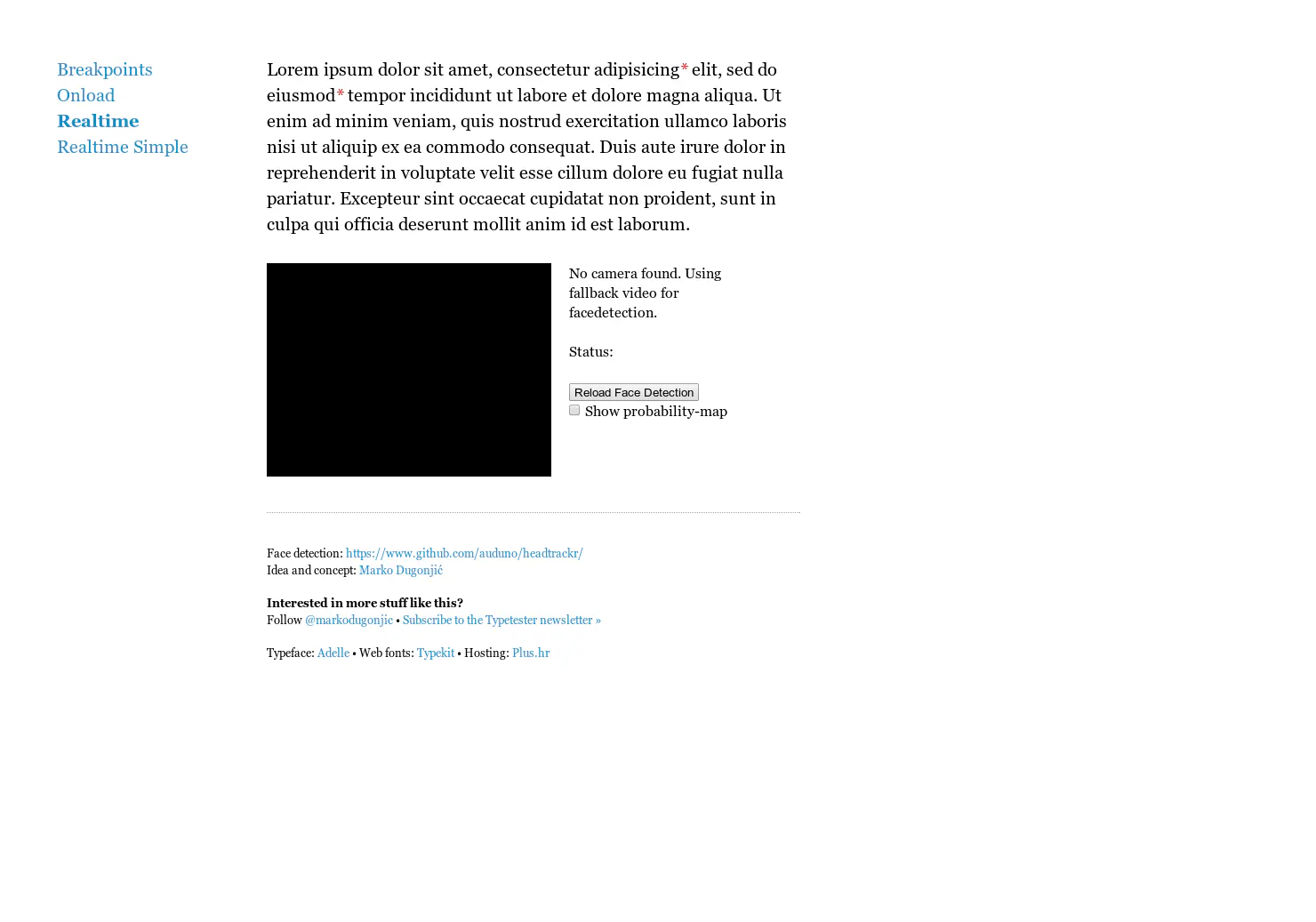
Responsive Type
Typography that changes based on distance from screen
Responsive Type launched on April 10, 2014 with 18 votes, #570 of 1,174 launches that month. The site was still online in September 2026, 12 years on.
What it does
Different font sizes for different reading distances are currently achievable by assuming a device’s form factor using @media queries. Long term, this is probably not ideal — that is, until reading distance-detection techniques, like the one you are testing right now, become more feasible. In the meantime, use Size Calculator by Nick Sherman and Chris Lewis to calculate the physical or perceived font size when factoring in reading distance and Universal Typography’s demo by Tim Brown of Nice Web Type, a very useful tool that can help you experiment with and adjust your paragraph proportions accordingly. Designed by Marko Dugonjić at Creative Nights Studios with Typetester , a next…from webdesign.maratz.com
Does a similar job
all alternatives →




More life & fun this month
the category →
A free city-building game in your browser. You are the mayor. You know what the city needs. Now get it past the zoning board, the neighbors, the appeals court and the next election.
Life & fun · 2d ago · permit.petercai.com
- IV
Life & fun · 14d ago · tanzaniaeducationproject.org

Turn a phone, tablet or TV into a sign. Type a message and it fills the screen: welcome signs, timers, Wi-Fi passwords and more. No app, no account, free.
Life & fun · 15d ago · bigwords.page

Play a free virtual guitar online with your keyboard or by touch. Slow songs down and see every chord, string and strum. Acoustic, classic, electric and bass.
Life & fun · 9d ago · guitoro.com

Carrier settings from iPhone, Pixel and Galaxy firmware, decoded and compared: APNs, VoLTE, 5G and Wi-Fi Calling per carrier, and what each build changed.
Life & fun · 13d ago · carrierexplode.com

Life & fun · 23d ago · space.bl2.net
Source: Product Hunt launch ↗
Launched alongside, April 2014
the whole month →- UA
Life & fun · 2014 · alex.nisnevich.com

GitBook is a knowledge platform that connects your docs, product and users, answers user questions, and identifies knowledge gaps. Docs-as-code support & AI insights included.
AI · 2014 · gitbook.io
- SP
Life & fun · 2014 · stefanom.org


- BA
Life & fun · 2014 · betatype.io