Life & fun · alternatives · 2026
24 alternatives to Responsive Type
Typography that changes based on distance from screen
Below are 24 products that do a similar job, ranked by how close each is in meaning and then by launch-day votes. Responsive Type launched in 2014; newer entries below may have overtaken it.
- 1
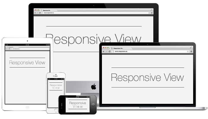 Responsive View▲216
Test your responsive design across different devices
2016 · responsiv.eu · its alternatives →
- 2

Check how responsive is your website across device sizes
2018 · its alternatives →
- 3

Take responsive screenshots with the click of a button
2017 · its alternatives →
- 4

View multiple screen dimensions in one view
2019 · chromewebstore.google.com · its alternatives →
- 5

- 6

Design beautiful web apps for any screen size.
2022 · its alternatives →
- 7
 Typeset.js▲81
Improve your website's typography
2015 · typeset.lllllllllllllllll.com · its alternatives →
- 8

- 9

- 10
 Am I Responsive▲108
see your website in multiple screen resolutions
2014 · fireship.dev · its alternatives →
- 11

Discover great fonts through themes.
2014 · typography.com · its alternatives →
- 12

It's exactly that... responsive pixel art 🙃
2016 · pixel.essenmitsosse.de · its alternatives →
- 13

- 14
- 15

- 16
- 17

- 18
 Spectral▲20
New ‘responsive’ Font can shapeshift to match any design
2017 · spectral.prototypo.io · its alternatives →
- 19
- 20
 Turret▲115
A Responsive Front-end Framework for accessible websites
2015 · bigfishtv.github.io · its alternatives →
- 21

Fully responsive and compatible with different browsers
2016 · poprad.cc · its alternatives →
- 22
 Screen Size Map▲206
An interactive map of screen sizes for responsive web design
2019 · screensizemap.com · its alternatives →
- 23
 Fonts In Use▲103
Type in the real world: an amazing archive of typography.
2014 · fontsinuse.com · its alternatives →
- 24
Also compare
Ranked by how close each launch is in meaning, then by votes. Prices were read from each product’s own site when checked and can change. Refine with your own description →