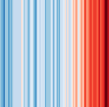
#ShowYourStripes
Visualize 100+ years of climate change where you live ❄️🌎🔥
#ShowYourStripes launched on June 22, 2019 with 140 votes, #173 of 2,757 launches that month and more than 90% of that year's launches. The site was still online in September 2026, 7 years on.
What it does
Produces a ‘warming stripe’ graphic that's a visual representations of the change in temperature as measured in each country over the past 100+ years. Each stripe represents the temperature in that country averaged over a year.
Visualising how the climate has changed for every country across the globe
Does a similar job
all alternatives →- AWA WebGL visualization to show how global temperature changed since 18502016 · callumprentice.github.io · ▲69
Global Temperature Change WebGL</i> is an experiment that tries to illustrate how global temperatures on earth have changed between 1850 and 2016.
- P3Plotting 3 years of hourly data in 150ms2020 · leeoniya.github.io · ▲785

- 4Y41 years sea surface temperature anomaliesApr 2026 · ssta.willhelps.org · ▲147
 E-Paper 7-color display showing the current weather2024 · github.com · ▲229
A hobby project of mine that was surprisingly easy to put together! I love waking up and seeing the freshly generated image.
 A world map of 24x365 average temperature “fingerprints”2021 · weatherspark.com · ▲347
More work this month
the category →
Endless lofi beats composed live in your browser, over pixel-art nights in Paris, Tokyo, New York, Hong Kong, Sydney, San Francisco and more. Free, no sign-up.
Work · 24d ago · loficities.com
 Smooth Recorder▲257
Mac screen recordings that look edited when you hit stop
Work · 18d ago · smoothrecorder.com


Work · 12d ago · readrare.com
Source: Product Hunt launch ↗
Launched alongside, June 2019
the whole month →
The biggest collection of free marketing resources
Growth · 2019 · nira.com

- BA
Dev tools · 2019 · kerkour.fr

- TP
Life & fun · 2019 · secretgeek.github.io