Work · alternatives · 2026
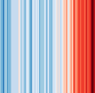
24 alternatives to #ShowYourStripes
Visualize 100+ years of climate change where you live ❄️🌎🔥
Below are 24 products that do a similar job, ranked by how close each is in meaning and then by launch-day votes. #ShowYourStripes launched in 2019; newer entries below may have overtaken it.
- 1AW
Global Temperature Change WebGL</i> is an experiment that tries to illustrate how global temperatures on earth have changed between 1850 and 2016.
2016 · callumprentice.github.io · its alternatives →
- 2P3
2020 · leeoniya.github.io · its alternatives →
- 3

- 44Y
Apr 2026 · ssta.willhelps.org · its alternatives →
- 5

A hobby project of mine that was surprisingly easy to put together! I love waking up and seeing the freshly generated image.
2024 · github.com · its alternatives →
- 6

2021 · weatherspark.com · its alternatives →
- 7

- 8
 Charts▲348
The most comprehensive collection of charts for Sketch
2019 · charts.graphics · its alternatives →
- 9

Something I've been working on this weekend: visualising climate change in the Netherlands. https://koenvangilst.nl/blog/rising-temperatures I particularly liked the heatmap with monthly temperature data since the 1900s. It's a lot of scrolling, but you can clearly see that climate is accelerating since the '90s.
2023 · koenvangilst.nl · its alternatives →
- 10

I built an interactive 3D globe to visualize climate change. Drag a temperature slider from -40°C to +40°C, set a timeframe (10 to 10,000 years), and watch sea levels rise, ice sheets melt, vegetation shift, and coastlines flood... per-pixel from real elevation and satellite data. Click anywhere on the globe to see projected snowfall changes for that location. --- I'm an amateur weather nerd who spends a lot of time on caltopo.com and windy.com tracking snow/ice conditions. I wanted to build something fun to imagine where I could go ski during an ice age. I used Google Deep Research…
Mar 2026 · terrashift.io · its alternatives →
- 11

Earth looked very different long ago. Search for addresses across 750 million years of Earth
2018 · dinosaurpictures.org · its alternatives →
- 12
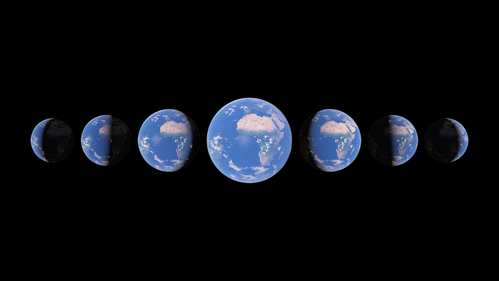
Watch time unfold and witness 40 years of planetary change
2021 · earth.google.com · its alternatives →
- 13DWDegrees What?▲171
One of my pet peeves is when people specify a temperature in "degrees" when it’s not clear from the context which scale is being used. I always want to ask “degrees what?” So I made this little conversion tool that uses degrees angle to convert between degrees Fahrenheit and degrees Celsius. Tip: you can add a number in a query to link directly to a temperature. e.g. https://degreeswhat.com/?100
2023 · degreeswhat.com · its alternatives →
- 14

GB Renewables Map an energy experiment created entirely in my free time (day job is visualisation at Octopus Energy). It's an interactive map showing live generation for major wind farms in Great Britain, showing what each wind farm is generating both now and in the past, and where that generation is physically located. Animated weather data is from WeatherLayers and shows current and historic wind conditions on the map, providing context to wind generation around the country. History mode allows you to go back in time and see wind generation and weather conditions for a particular date and…
2023 · renewables-map.robinhawkes.com · its alternatives →
- 15

Catalog of all chart types and tools to build them
2017 · visualizationuniverse.com · its alternatives →
- 16UW
2013 · uk.temperature.at · its alternatives →
- 17

The easiest way to track climate change metrics.
2022 · climatechangetracker.org · its alternatives →
- 18
 El Niño▲71
See live signals from the Pacific warming climate
Jul 2026 · elnino.tony.expert · its alternatives →
- 19CD
2018 · carbondoomsday.com · its alternatives →
- 20

2020 · todaystrends.app · its alternatives →
- 21

An Interactive History of the Git Distributed Version Control System
2021 · git-history.jpalmer.dev · its alternatives →
- 22

- 23

Weather app for expats showing °C and °F side-by-side
2018 · apps.apple.com · its alternatives →
- 24FW
2012 · callum.com · its alternatives →
Also compare
- A WebGL visualization to show how global temperature changed since 1850 alternatives
- Plotting 3 years of hourly data in 150ms alternatives
- Stripe Climate alternatives
- 41 years sea surface temperature anomalies alternatives
- E-Paper 7-color display showing the current weather alternatives
- A world map of 24x365 average temperature “fingerprints” alternatives
Ranked by how close each launch is in meaning, then by votes. Prices were read from each product’s own site when checked and can change. Refine with your own description →