Life & fun · alternatives · 2026

24 alternatives to Visualising Rising Temperatures for the Netherlands
Something I've been working on this weekend: visualising climate change in the Netherlands. https://koenvangilst.nl/blog/rising-temperatures I particularly liked the heatmap with monthly temperature data since the 1900s. It's a lot of scrolling, but you can clearly see that climate is accelerating since the '90s.
Below are 24 products that do a similar job, ranked by how close each is in meaning and then by launch-day votes. Visualising Rising Temperatures for the Netherlands launched in 2023; newer entries below may have overtaken it.
- 1
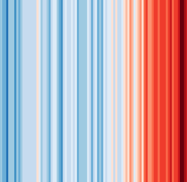 #ShowYourStripes▲140
Visualize 100+ years of climate change where you live ❄️🌎🔥
2019 · showyourstripes.info · its alternatives →
- 2

Last weekend, I tried creating an original visualization of something on many minds in my home country the Netherlands: land use. Much of our discussion revolves around land use—housing crisis, sustainable farming, solar energy—it's all about the land. To illustrate this, I created a map where each hexagon represents 0.06% (26,647 hectares) of land in the Netherlands. The color indicates the type of land use.
2024 · koenvangilst.nl · its alternatives →
- 3

GB Renewables Map an energy experiment created entirely in my free time (day job is visualisation at Octopus Energy). It's an interactive map showing live generation for major wind farms in Great Britain, showing what each wind farm is generating both now and in the past, and where that generation is physically located. Animated weather data is from WeatherLayers and shows current and historic wind conditions on the map, providing context to wind generation around the country. History mode allows you to go back in time and see wind generation and weather conditions for a particular date and…
2023 · renewables-map.robinhawkes.com · its alternatives →
- 4AW
Global Temperature Change WebGL</i> is an experiment that tries to illustrate how global temperatures on earth have changed between 1850 and 2016.
2016 · callumprentice.github.io · its alternatives →
- 5
 HotOrCold▲101
Know how much it went hotter/colder than yesterday
2015 · apps.apple.com · its alternatives →
- 6

For the past few months, I've been working on a website that answers two different questions: - Where in my city have the best travel times to all the things and people I care about? - Given a listing, how far is it from all the things and people I care about? Personally this was fueled by my own frustrations when I was apartment hunting in NYC. I was frustrating to have to juggle so many Google Maps tabs when I was evaluating a listing, and it was also annoying to not have full confidence that I was even searching in the right places. I wanted to be close to work, a Trader Joe's, and a…
2025 · theretowhere.com · its alternatives →
- 7

- 8

- 9

Weather app for expats showing °C and °F side-by-side
2018 · apps.apple.com · its alternatives →
- 10DWDegrees What?▲171
One of my pet peeves is when people specify a temperature in "degrees" when it’s not clear from the context which scale is being used. I always want to ask “degrees what?” So I made this little conversion tool that uses degrees angle to convert between degrees Fahrenheit and degrees Celsius. Tip: you can add a number in a query to link directly to a temperature. e.g. https://degreeswhat.com/?100
2023 · degreeswhat.com · its alternatives →
- 11

2021 · weatherspark.com · its alternatives →
- 12

- 13

A hobby project of mine that was surprisingly easy to put together! I love waking up and seeing the freshly generated image.
2024 · github.com · its alternatives →
- 144Y
Apr 2026 · ssta.willhelps.org · its alternatives →
- 15
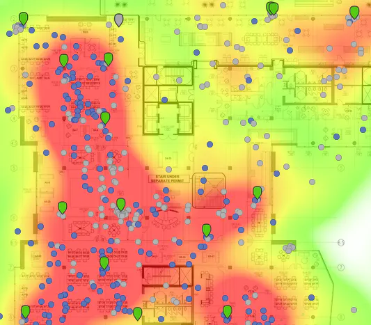
Visualizing your collected Google Location History data
2014 · theopolis.me · its alternatives →
- 16

We have another election coming up at the end of this month here in the Netherlands, and how we use our limited land is a hotly debated topic. Last year also I shared this animated hexagonal map of Dutch land use. I've now expanded this to include several more European countries, so you can see what makes Dutch land use so special - or not. If you want to help add more countries, I'd appreciate PRs on GitHub. The map rendering is already there, it only requires land use data which can be found in the SQLite database (at least for EU countries). Github:…
2025 · onsland.koenvangilst.nl · its alternatives →
- 17

The easiest way to track climate change metrics.
2022 · climatechangetracker.org · its alternatives →
- 18
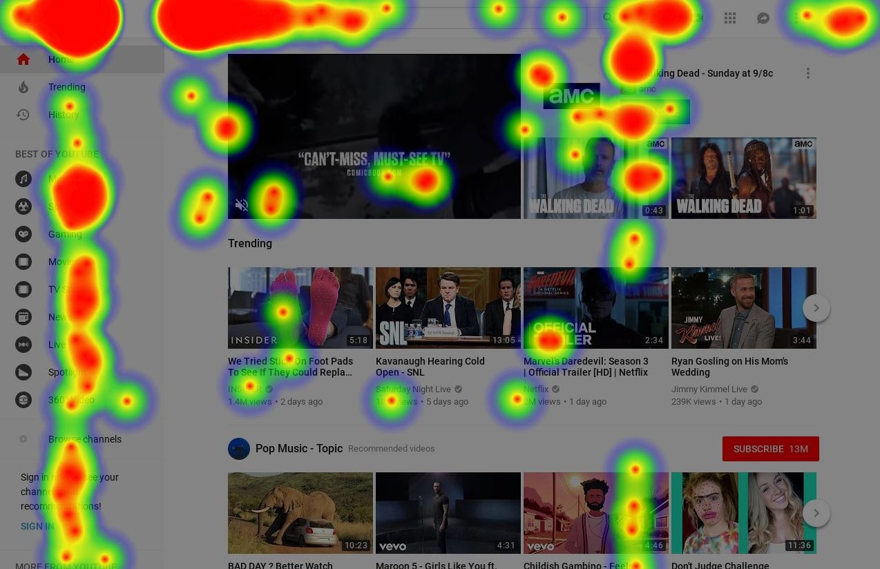
Any website's heatmap data is at your fingertips
2018 · its alternatives →
- 19

Visualize Google location history data on a heatmap 🗺️
2018 · locationhistoryvisualizer.com · its alternatives →
- 20

Explore global weather forecasts on interactive maps with temperature, wind, and precipitation overlays. 16-day outlooks for cities worldwide, powered by NOAA GFS.
2014 · weather-explorer.com · its alternatives →
- 21

Historical weather report re-imagined and beautiful.
2014 · weather-radials.com · its alternatives →
- 22

Hi HN, I recently noticed a recurring visual artifact in the "Most Replayed" heatmap on the YouTube player. The highest peaks were always surrounded by two dips. I got curious about why they were there, so I decided to reverse engineer the feature to find out. This post documents the deep dive. It starts with a system design recreation, reverse engineering the rendering code, and ends with the mathematics. This is also my first attempt at writing an interactive article. I would love to hear your thoughts on the investigation and the format.
Jan 2026 · priyavr.at · its alternatives →
- 23

I built an interactive 3D globe to visualize climate change. Drag a temperature slider from -40°C to +40°C, set a timeframe (10 to 10,000 years), and watch sea levels rise, ice sheets melt, vegetation shift, and coastlines flood... per-pixel from real elevation and satellite data. Click anywhere on the globe to see projected snowfall changes for that location. --- I'm an amateur weather nerd who spends a lot of time on caltopo.com and windy.com tracking snow/ice conditions. I wanted to build something fun to imagine where I could go ski during an ice age. I used Google Deep Research…
Mar 2026 · terrashift.io · its alternatives →
- 24UW
2013 · uk.temperature.at · its alternatives →
Also compare
- #ShowYourStripes alternatives
- I created this land use visualisation for the Netherlands alternatives
- An interactive map showing live wind farm generation in Great Britain alternatives
- A WebGL visualization to show how global temperature changed since 1850 alternatives
- HotOrCold alternatives
- A website that heatmaps your city based on your housing preferences alternatives
Ranked by how close each launch is in meaning, then by votes. Prices were read from each product’s own site when checked and can change. Refine with your own description →