
Visualizing World Birth and Death Rates
World births and deaths, simulated in real-time on a map
Visualizing World Birth and Death Rates launched on June 23, 2015 with 1 votes. The site was still online in September 2026, 11 years on.
What it does
Watch a real-time statistical simulation of births, deaths, and world population changes on an interactive 2D map and 3D globe, with a personal Life Arc estimate.
This visualization works best on Chrome , Firefox , or Safari . Performance on Internet Explorer is suboptimal. A broad statistical illustration based on age and a simplified U.S.-style actuarial curve—not an individual or medical prediction. Lifestyle, health, place, and future conditions are not modeled in thisfrom worldbirthsanddeaths.com
Does a similar job
all alternatives →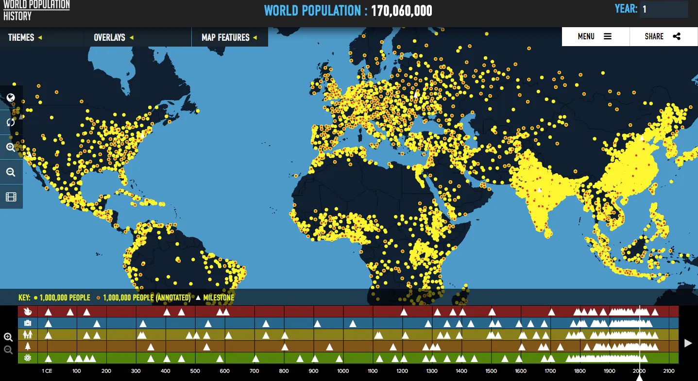 World Population : An Interactive Experience2016 · worldpopulationhistory.org · ▲3
Visualizes global population trends over the last two thousa
 Population Project2015 · population.io · ▲171
Your life in numbers and dates. How long will you live?


- WPWorld Population with D32014 · roadtolarissa.com · ▲94
 Homicide Watch2015 · homicide.igarape.org.br · ▲80
Explore the distribution and dynamics of global homicides
More life & fun this month
the category →
A free city-building game in your browser. You are the mayor. You know what the city needs. Now get it past the zoning board, the neighbors, the appeals court and the next election.
Life & fun · 2d ago · permit.petercai.com
- IV
Life & fun · 14d ago · tanzaniaeducationproject.org

Turn a phone, tablet or TV into a sign. Type a message and it fills the screen: welcome signs, timers, Wi-Fi passwords and more. No app, no account, free.
Life & fun · 15d ago · bigwords.page

Play a free virtual guitar online with your keyboard or by touch. Slow songs down and see every chord, string and strum. Acoustic, classic, electric and bass.
Life & fun · 9d ago · guitoro.com

Carrier settings from iPhone, Pixel and Galaxy firmware, decoded and compared: APNs, VoLTE, 5G and Wi-Fi Calling per carrier, and what each build changed.
Life & fun · 13d ago · carrierexplode.com

Life & fun · 23d ago · space.bl2.net
Source: Product Hunt launch ↗
Launched alongside, June 2015
the whole month → Startup Launch List▲1,251
Articles you need to read before launching a startup.
Growth · 2015 · startuplaunchlist.com

Get any site's company logo with just a URL
Dev tools · 2015 · clearbit.com


