Work · alternatives · 2026

24 alternatives to Peasy Plot
The fastest route from CSV to presentation-ready charts.
Below are 24 products that do a similar job, ranked by how close each is in meaning and then by launch-day votes.
- 1

- 2

Create pro-level graphs that drive actions
2024 · graphy.app · its alternatives →
- 3

- 4

- 5

Free chart maker & visual exploration for spreadsheet data
2020 · its alternatives →
- 6
 CSV Plot▲6
Turn Your CSV Data into Insights in Seconds.
Jan 2026 · csvplot.netlify.app · its alternatives →
- 7

- 8
 Pie Chart Maker▲103
Create a Pie Chart for free with easy to use tools
2022 · piechartmaker.co · its alternatives →
- 9

I built a simple tool that converts CSV files into graphs instantly. The idea came from seeing how much time people spend opening spreadsheets or writing code just to visualize data. I wanted something where you can just upload a CSV and get charts immediately. It currently supports quick line and basic chart visualizations from CSV datasets. I’d really appreciate feedback from people who work with data or frequently analyze CSV files.
Mar 2026 · plotiq-web.web.app · its alternatives →
- 10

- 11

- 12

- 13

Beautiful charts, slides & KPI cards. AI-powered & 100% free
Dec 2025 · prettychart.app · its alternatives →
- 14

Paste CSV data, get an instant chart, and share a permalink that keeps the visualization and raw data together.
Mar 2026 · tinychart.io · its alternatives →
- 15

Build, present and share animated data stories in Jupyter Notebook and similar environments. - vizzuhq/ipyvizzu-story
2022 · github.com · its alternatives →
- 16

Build animated charts in Jupyter Notebook and similar environments with a simple Python syntax. - vizzuhq/ipyvizzu
2022 · github.com · its alternatives →
- 17

Easy way to make scatter plots from Excel or CSV data.
2017 · scatterplot.online · its alternatives →
- 18
- 19

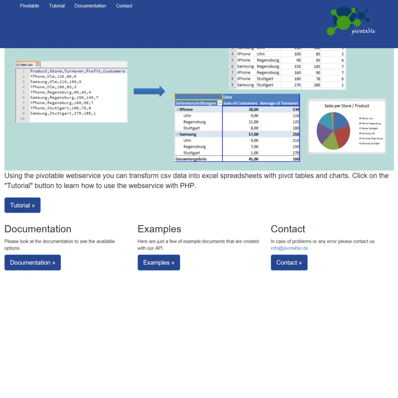
Turn Tables Into Stunning Graphs-No Coding, Just Clarity!
2025 · its alternatives →
- 20

After releasing our open-source tool to build animated charts in Jupyter and other computational notebooks (https://news.ycombinator.com/item?id=30895975), we got two requests from data scientists: 1. They lacked the opportunity to use these charts to present their findings and control the animation better than just (re)running notebook cells. 2. They had challenges using our generic chart-building engine - they are more acquainted with picking a chart type and using the parameters specific to that type. So we decided to build a new extension that enables our users to add the…
2022 · github.com · its alternatives →
- 21
- 22

Create professional box plots instantly. Free box plot maker with CSV upload, automatic outlier detection, and PNG export. No signup required.
Nov 2025 · boxplotmaker.online · its alternatives →
- 23

- 24

Also compare
Ranked by how close each launch is in meaning, then by votes. Prices were read from each product’s own site when checked and can change. Refine with your own description →