Growth · alternatives · 2026

24 alternatives to Transit Stats - CTA Analytics
Turn Chicago CTA rides into meaningful personal data
Below are 24 products that do a similar job, ranked by how close each is in meaning and then by launch-day votes.
- 1PT
Comprehensive information about public transit systems worldwide.
Mar 2026 · publictransit.systems · its alternatives →
- 2
 Uber Transit▲167
Uber now offers real time data for public transportation
2019 · uber.com · its alternatives →
- 3
 Transit▲123
Real-time transit data and a bot to help you commute
2016 · transitapp.com · its alternatives →
- 4
 UberStats▲226
Visualize statistics on your years of Uber rides!
2018 · chromewebstore.google.com · its alternatives →
- 5

- 6

- 7
 Loop▲86
Chicago's best transit app for commuters, students, tourists
2021 · apps.apple.com · its alternatives →
- 8

You might remember MYmta, and maybe you loved it, but it was impossible to maintain. The Digital Services team at the MTA + Axon Vibe + many others contributed to relaunching the official MTA app with new features based on user feedback. Let us know what you think!
2024 · apps.apple.com · its alternatives →
- 9

This was something I built while trying to look for housing in Toronto that was decently transit-accessible to my office while still cheap. The backend is written in Rust. It parses public GTFS data from transit agencies and performs a simple heuristics-based BFS on the bus lines to calculate how long to reach all points in a city. The frontend uses React and Mapbox GL to render each individual road segment based on how long it takes to reach. This project was a great excuse to learn Rust, deployments, and mapping. The source code is here if you are interested:…
2023 · map.henryn.xyz · its alternatives →
- 10
 Totals for Uber▲180
See how many miles you've traveled and hours spent in Uber
2015 · uber.totals.io · its alternatives →
- 11

- 12

- 13

- 14

- 15
 Travel Score▲82
Map the percentage you traveled in the world
2015 · travelscore.org · its alternatives →
- 16
- 17
 RideScout▲69
Aggregates transportation apps—e.g. taxi, bike, transit, etc
2014 · ridescoutapp.com · its alternatives →
- 18

As a side project I built Sydney Transit Graph - a visualisation of real-time Sydney bus congestion. Each line on the graph (a Marey chart) represents a bus completing its route (percentage) over time.
2022 · jakecoppinger.com · its alternatives →
- 19
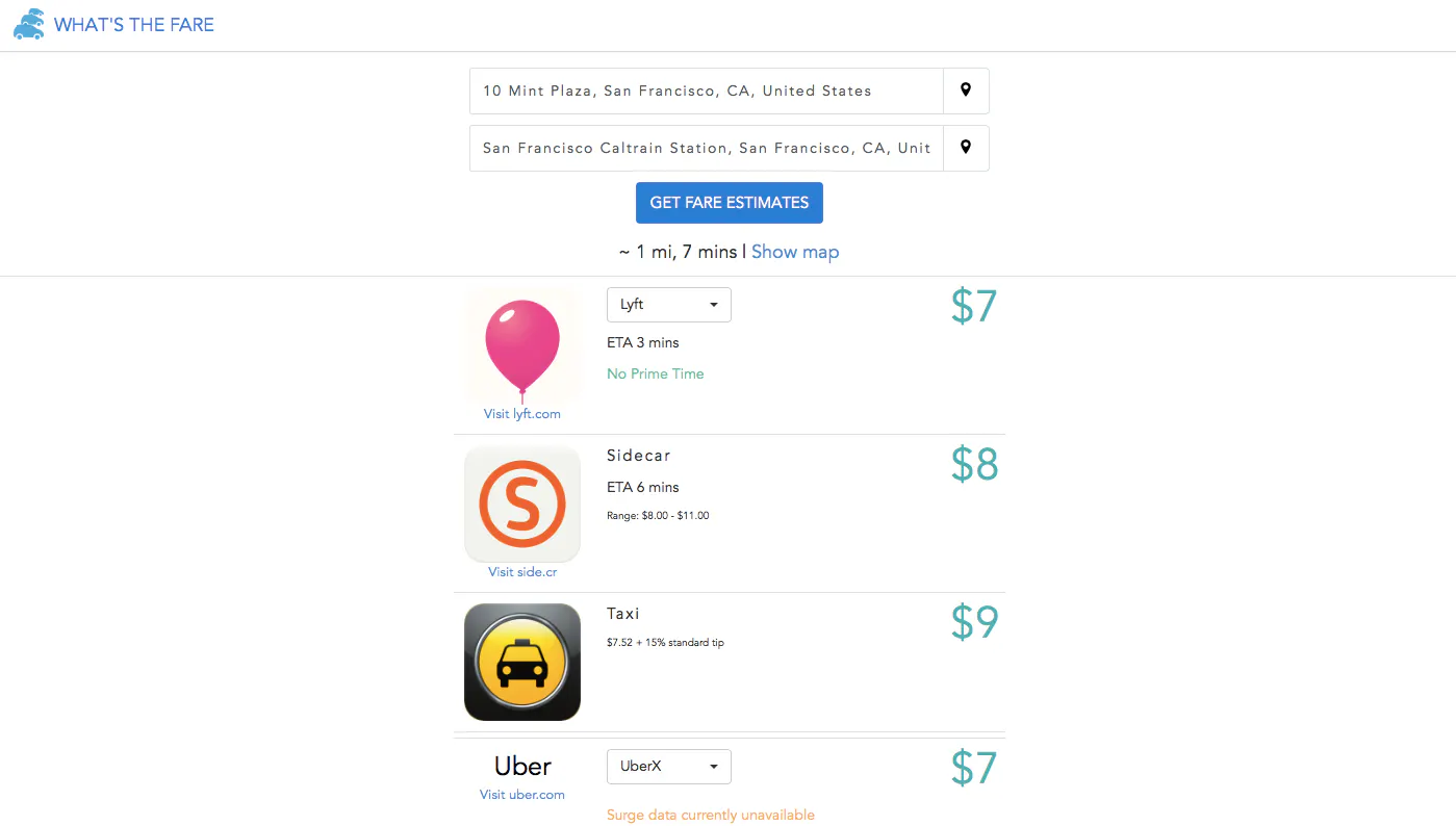
Real-time Fare Estimate Comparisons for Uber & Lyft
2014 · whatsthefare.com · its alternatives →
- 20TC
2013 · transitfeeds.com · its alternatives →
- 21

- 22

Each moving arrow represents one real bike ride out of 291 million, and if you've ever taken a Citi Bike before, you are included in this massive visualization! You can search for your ride using Cmd + K and your Citi Bike receipt, which should give you the time of your ride and start/end station. Everything is open source: https://github.com/freemanjiang/bikemap Some technical details: - No backend! Processed data is stored in parquet files on a Cloudflare CDN, and queried directly by DuckDB WASM - deck.gl w/ Mapbox for GPU-accelerated rendering of thousands of…
Jan 2026 · bikemap.nyc · its alternatives →
- 23
- 24

Also compare
Ranked by how close each launch is in meaning, then by votes. Prices were read from each product’s own site when checked and can change. Refine with your own description →