Mortality Rates in the US Visualized
Mortality Rates in the US Visualized launched on October 28, 2013 with 92 votes, #18 of 565 launches that month and more than 95% of that year's launches.
In plain words
Mortality Rates in the US Visualized is an interactive tool that displays death statistics across the United States. Launched in 2013, it presents data on how mortality rates vary by region and demographic factors. The tool is designed for researchers, students, public health professionals, and anyone interested in understanding patterns of death in America. It transforms complex mortality data into accessible visual formats to help users explore trends and comparisons across different populations and geographic areas.
written from the facts on this page · September 2026
Does a similar job
all alternatives →- WPWorld Population with D32014 · roadtolarissa.com · ▲94

- DVData visualization news2017 · dvblogger.com · ▲76

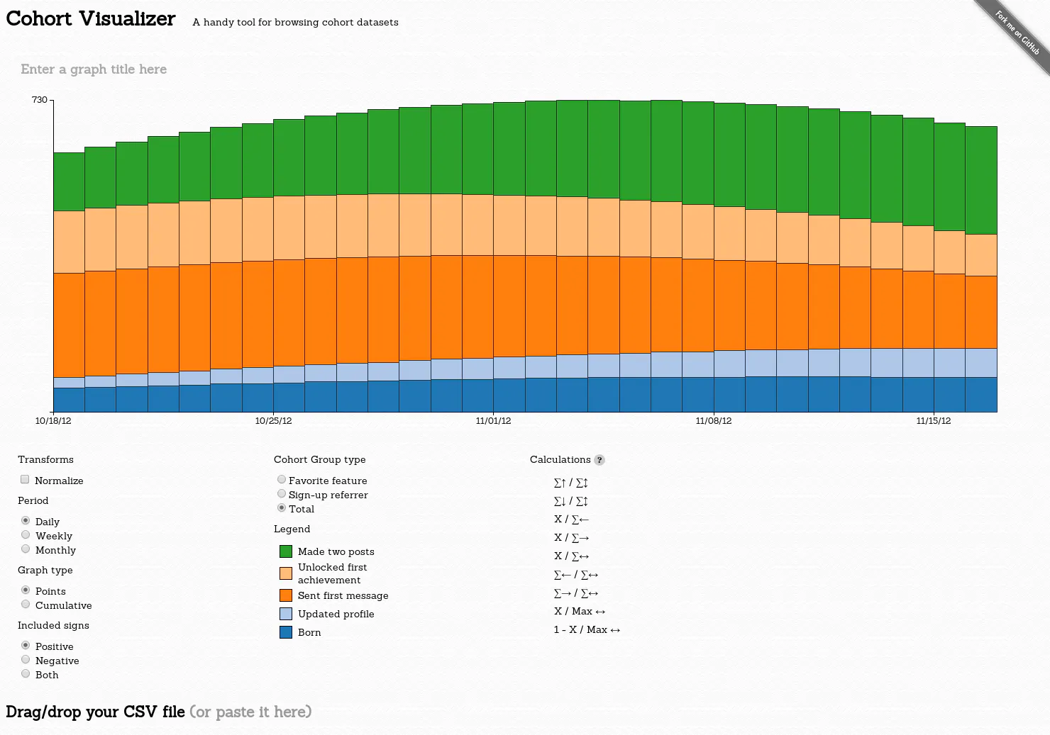
- ATA tool that lets you visualize how people use your website in realtime2014 · seeyourvisitors.com · ▲69
More life & fun this month
the category →
A free city-building game in your browser. You are the mayor. You know what the city needs. Now get it past the zoning board, the neighbors, the appeals court and the next election.
Life & fun · 1d ago · permit.petercai.com
- IV
Life & fun · 14d ago · tanzaniaeducationproject.org

Turn a phone, tablet or TV into a sign. Type a message and it fills the screen: welcome signs, timers, Wi-Fi passwords and more. No app, no account, free.
Life & fun · 15d ago · bigwords.page

Play a free virtual guitar online with your keyboard or by touch. Slow songs down and see every chord, string and strum. Acoustic, classic, electric and bass.
Life & fun · 8d ago · guitoro.com

Carrier settings from iPhone, Pixel and Galaxy firmware, decoded and compared: APNs, VoLTE, 5G and Wi-Fi Calling per carrier, and what each build changed.
Life & fun · 12d ago · carrierexplode.com

Life & fun · 22d ago · space.bl2.net
Source: Show HN post ↗
Launched alongside, October 2013
the whole month →
Run KolibriOS, Linux or Windows 98 in your browser
Life & fun · 2013 · copy.sh
- WI
Work · 2013 · gaganpreet.github.io
- GCgovuptime.com▲267
Life & fun · 2013 · govuptime.com
- IH
Life & fun · 2013 · sintaxi.com
 Sketchology▲212
Life & fun · 2013 · sketchologyapp.com
- AG
Dev tools · 2013 · penflip.com