Commerce · alternatives · 2026

24 alternatives to World GDP Treemap
Visualize & filter global GDP data with drill-down treemaps
Below are 24 products that do a similar job, ranked by how close each is in meaning and then by launch-day votes.
- 1

Visualize 100+ world indicators across 200+ countries
2025 · globydata.xyz · its alternatives →
- 2
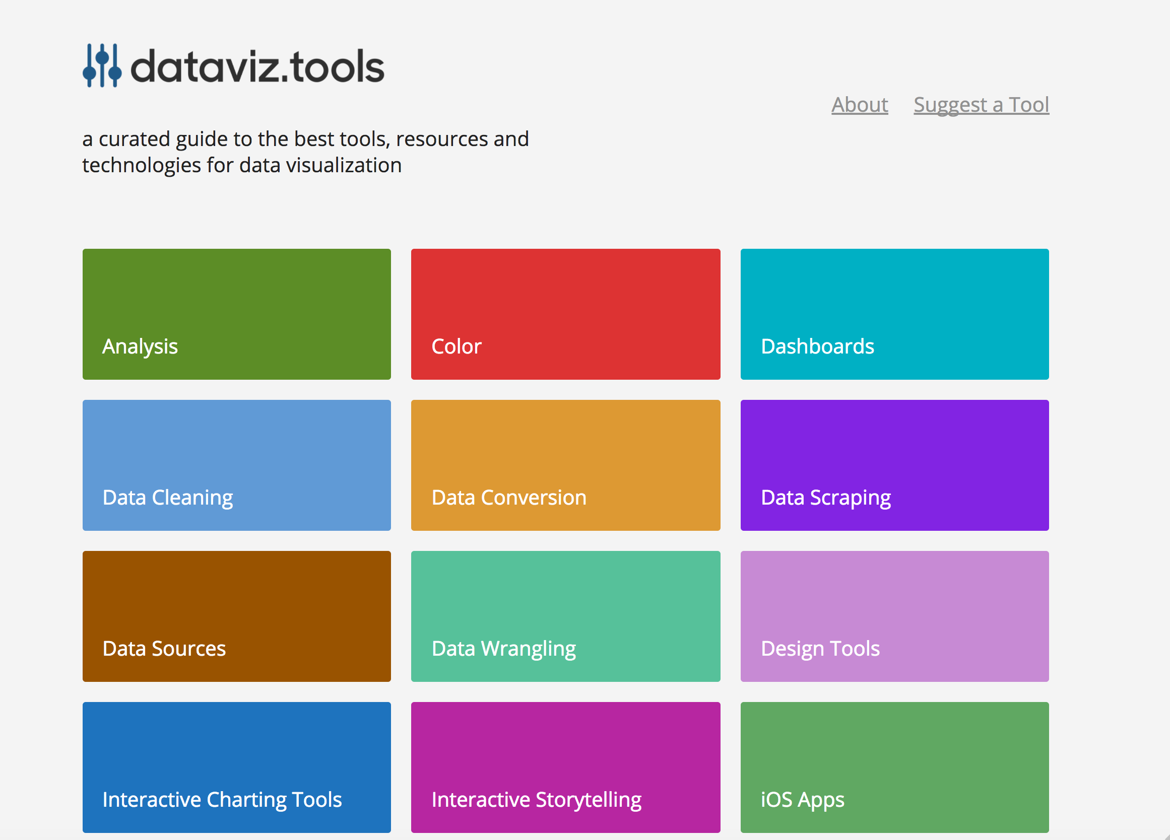 dataviz.tools▲409
Curated collection of the 400 best data visualization tools
2017 · dataviz.tools · its alternatives →
- 3

Flexible tool to build planet-scale vector tilesets from OpenStreetMap data fast - onthegomap/planetiler
2021 · github.com · its alternatives →
- 4

Create slick reports from World Bank data using charts, heatmaps, and tables.
2017 · worldoscope.cxjs.io · its alternatives →
- 5G3
I made a web app to generate 3D models of real places on earth from land cover and elevation data. Click anywhere on the map to get a polygon, and then click "generate". It should work at most scales, but if your watershed or region selection is too large, the result can be less exciting because it's so flat. As a warning, the 3D models can sometimes be too much for my phone. It's nicer on desktop. I'm still working better on mobile support. The land cover data I'm using gives a cool effect, but at some point I'd like to add in global imagery and clouds. The backend is a Python thread…
2025 · topography.jessekv.com · its alternatives →
- 6WP
2014 · roadtolarissa.com · its alternatives →
- 7LW
Hi HN, I made a web game to practice country locations a while ago and HN liked it, so I thought I'd post my updated version as well. As for how the game works and feels, I'd really recommend you checking it out for yourself, it's free, no signup, no ads. The tech stack is Vue + ts + Tailwind/Daisy for the looks. The learning algorithm is a slight modification of the ts version of FSRS. If you have anything to add, it's open source as well (https://github.com/koljapluemer/learn-worldmap), although not well documented yet. In the end it's just a little sideproject,…
2025 · map.koljapluemer.com · its alternatives →
- 8IB
Hi all, I am not an expert in nuclear energy but I've always wondered and found it difficult to get a clear picture about the amount of nuclear stations located in a specific region. So I built this tool that shows all the nuclear plants in the world, scaled by their capacity and with indication of their status. Clustering is enabled by default and allows to see the sum potential capacity of a region. It's a fun tool for me: e.g. disable clustering, scale circle radius to 70%, go to EU, and you'll see Germany has shutdown all of the stations. Ofc it's a widely known fact, but what came to my…
2024 · nuclearstations.com · its alternatives →
- 9

- 10IM
Hi HN, I built a little tool to help me get better at remembering country locations on the map: https://learn-worldmap.netlify.app/ It's made from plain HTML/CSS/JS, and not intended to make any money or anything. Just thought that maybe someone else may enjoy it. Also of course happy about any feedback! Cheerz.
2023 · learn-worldmap.netlify.app · its alternatives →
- 11

A free collection of maps for every country in the world, available in 11 sizes or in SVG. - djaiss/mapsicon
2013 · github.com · its alternatives →
- 12

- 13

Simplifying on-site data collection for forest restoration
2021 · plant-for-the-planet.org · its alternatives →
- 14

Hey HN, jvaclavik here from OpenClimbing team! We are thrilled to release version 2.0 of our fully opensource/opendata climbing guide. Based on OpenStreetMap for map-data and Wikimedia Commons for images, we created a (hopefully) user-friendly app which completely uses these open databases, thus contributing data back to commons. We designed a simple and powerful notation for drawing climbing routes directly over the Wikimedia pictures: - https://wiki.openstreetmap.org/wiki/Key:wikimedia_commons:pa... Check out the release article for a ton of new features, or go…
2014 · openstreetmap.org · its alternatives →
- 15

We have another election coming up at the end of this month here in the Netherlands, and how we use our limited land is a hotly debated topic. Last year also I shared this animated hexagonal map of Dutch land use. I've now expanded this to include several more European countries, so you can see what makes Dutch land use so special - or not. If you want to help add more countries, I'd appreciate PRs on GitHub. The map rendering is already there, it only requires land use data which can be found in the SQLite database (at least for EU countries). Github:…
2025 · onsland.koenvangilst.nl · its alternatives →
- 16

Last weekend, I tried creating an original visualization of something on many minds in my home country the Netherlands: land use. Much of our discussion revolves around land use—housing crisis, sustainable farming, solar energy—it's all about the land. To illustrate this, I created a map where each hexagon represents 0.06% (26,647 hectares) of land in the Netherlands. The color indicates the type of land use.
2024 · koenvangilst.nl · its alternatives →
- 17IE
2017 · mjmdavis.com · its alternatives →
- 18MMapipedia▲61
A web platform I've written to make it easy for people to share goespatial time series data and display it on animated heatmaps. There's also a social media component that allows you to write comments, follow, share and like data sets that you want to engage with. You can also download the CSV data and embed animations into your own websites. People uploading datasets can also choose to make money by accepting donations. Please check out the home page for more details: https://mapipedia.com Here are some samples of things created with the platform (press the play button to start…
2019 · its alternatives →
- 19

Beautiful graphics of imports and exports by country
2016 · atlas.hks.harvard.edu · its alternatives →
- 20

Free & interactive language world map. Discover with how many people you can communicate, and share your coloured map and results!
2023 · bilingualjobs.io · its alternatives →
- 21

2016 · oracleofnj.github.io · its alternatives →
- 22

A web publication showcasing empirical research and data
2016 · ourworldindata.org · its alternatives →
- 23GT
- 24FWForest Watch▲72
Keep track of forests in your area by viewing changes in tree cover over time. I’ve build this as a demo of what you can do with the ArcGIS library and the geo data that is offered by Global Forest Watch and Esri. Don’t forget to click the history button. Works best on desktop! The demo is build with React and open source: https://github.com/vnglst/koenvangilst.nl/tree/main/app/(bla...
2024 · koenvangilst.nl · its alternatives →
Also compare
Ranked by how close each launch is in meaning, then by votes. Prices were read from each product’s own site when checked and can change. Refine with your own description →